On Monday we had a quick squiz at how the fallout from the GFC had changed the unemployment rates at the regional level since the 2007 election. What stood out was how the impact from the downturn was being felt harder in the wealthier suburbs and the inner cities, while large swathes of the outer suburbs — the places that usually get hit when the economy goes south — were faring pretty well, with some even experiencing reductions in their unemployment rates over the course of the GFC.
Yet unemployment doesn’t tell the full story. One of the defining labour market features of this downturn is how employers are continuing to horde labour — preferring to reduce the hours and pay of their workforce rather than reduce its overall size. As a result, while unemployment rates tell us something about the location of those that have lost their job or cannot find one, they say nothing at all about those that are experiencing income reductions while still keeping their jobs.
Thankfully, the Department of Human Services provides some Centrelink data that may help us in this regard — at least as far as those areas in Australia are concerned where the majority of income earners are around or below the means test threshold for government transfer payments. They have data sets for June of 2008 and January of 2009, allowing us to take the difference between the two periods and look at how the data has changed.
The three metrics we can use here are firstly, Family Tax Benefit Part A, where growth in FTB A recipient numbers over that six-month period would have a component caused by family income reduction, bringing household income back under the means test threshold.
Secondly, Family Tax Benefit Part B, where growth in FTB B numbers would have a component caused by one partner losing their job or otherwise retreating from the labour market. Finally, we can also use the growth in Newstart numbers.
To build a bit of an indicative index, if we rank every electorate from lowest to highest on each of these three metrics, and then add up the individual rankings for each seat, we have a set of numbers that show how any given electorate stacks up relative to others in terms of the growth in income support payments. What needs to be remembered here is that the wealthier electorates — places like Higgins, Goldstein, Warringah and the like — won’t appear very high in these maps as many of the residents will fail the means tests for transfer payments. The focus of the exercise is to see which parts of low-middle income areas in Australia are getting hit with the most widespread income reduction effects as measured through the increase in government transfer payments.
If we map this data where blue represents the electorates with the lowest growth in transfer payments, while bright red represents the highest growth — some interesting things pop out. If you’d like the maps with more detail, labels and higher resolution, you can find them over here, along with other parts of the country.
First up, Sydney.
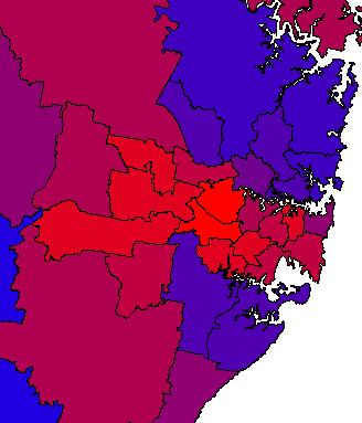
The outer western suburbs are again, as they were with unemployment, performing well. The likes of Lindsay, Greenway and Parramatta have experienced only moderate growth in transfer payments. It’s the middling suburbs, from Fowler and Chifley into Banks and Watson that are getting hit hardest on the income reduction front among low-middle income earners.
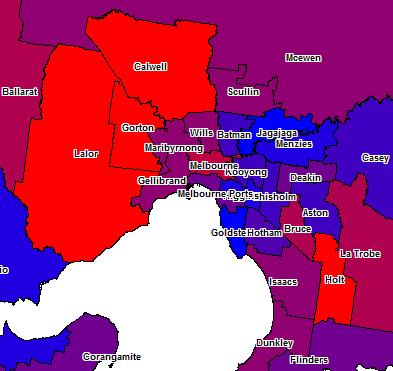
Melbourne tells us a similar story, where not all of the usual suspects are getting smacked around.
The most interesting however is Brisbane.

At the last recession, the outer north western suburbs that make up a large chunk of the seat of Dickson were at the front line of the economic fallout. However this downturn we have Dickson registering transfer payment growth akin to blue ribbon Liberal seats like Mayo and Menzies rather than the working and lower middle class suburbs that actually make most of it up. This downturn we have the Gold Coast seats in Qld taking the hit, and moving west and north into Forde and up to Oxley.
While unemployment is generally hitting the wealthy inner city suburbs the hardest, the growth in government transfer payments isn’t following a similarly obvious pattern. The fallout from this downturn doesn’t follow the usual narrative — it’s more particular, more granular, more localised — as if Australia were actually 150 different economies rather than one and where all are operating according to their own set of unique conditions. It’s part of the reason why so many people of late, have been struggling to get a real grip with what is happening with the Australian economy on the ground.


Crikey is committed to hosting lively discussions. Help us keep the conversation useful, interesting and welcoming. We aim to publish comments quickly in the interest of promoting robust conversation, but we’re a small team and we deploy filters to protect against legal risk. Occasionally your comment may be held up while we review, but we’re working as fast as we can to keep the conversation rolling.
The Crikey comment section is members-only content. Please subscribe to leave a comment.
The Crikey comment section is members-only content. Please login to leave a comment.