A point that often gets missed in the day to day political hyperbole over discussion of the stimulus and unemployment, is the actual temporal nature of unemployment itself.
One of the usual clichés that get thrown around with these so called debates, is that the stimulus has “cost $X for every projected job saved” type thing. The problem with this argument is that it is not only wrong, it is dishonestly wrong. Massively, dishonestly, wrong.
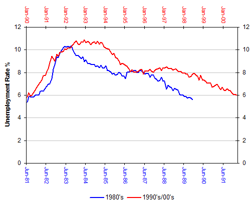
The inherent “wrongness” of it all derives from the way unemployment operates across time. To describe it properly, we can do it best with a few charts. There have been three relatively recent economic downturns in Australia – one in the early 1980’s, another one in the early 1990’s, as well as the one we are currently in today. To start with, if we just take the 1980’s and 1990’s downturns and chart the unemployment rate caused by the two downturns from the time it first started to rise in each period through to the point where it fully recovered, this is what we get:
These two downturns brought about a sharp upswing in the unemployment rate that took literally years to wash out of the system. This is by no means unusual as it’s the way unemployment generally works all around the world after a downturn hits – it takes a lot longer to repair the employment damage than it does to create it in the first place.
Let us now bring in our current unemployment experience at the moment. To do this we’ll have to replace the actual real dates on the horizontal axis – so we’ll measure the change in the unemployment rate in terms of months, starting from the first month unemployment rose in all three periods.
We’ll also have to change the unemployment rate as our measure for the vertical axis to let all three downturns become comparable. So rather than use the raw unemployment rate, we’ll use the change in the unemployment associated with the respective downturns. So in June 1981 for example (the month before the 80’s recession started to hit unemployment), the unemployment rate was 5.4%. In July of that year (one month later) it grew by 0.5% to 5.9% – so the measure for the 1st month for the 1980’s series would be 0.5.
Similarly, in 1990’s recession, In December 1989 the unemployment rate was 5.6%. The next month, January 1990, it jumped to 5.8% – so the measure for the 1st month of the 1990’s/00’s series would be 0.2%.
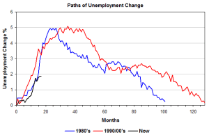
When we combine the three downturns into the same chart, now that we have a comparable set of metrics, we get (click to expand):
This is where it gets interesting – the unemployment consequences from the 1980’s downturn took around 100 months to wash out of the system. The 1990s downturn took longer, around 130 months to wash out of the system.
What we’re about to do now is only for explanatory purposes, to highlight the importance of time when it comes to looking at unemployment.
You’ll notice that the rate of unemployment growth during the 80’s and 90’s downturns (the slope of the blue and red lines up to around month 30) was very similar, as was the rate of recovery in unemployment over the ensuing years (the broad slope of the red and blue lines after unemployment peaked). We can take a look at how the change in the unemployment rate we are currently experiencing might look in two scenarios.
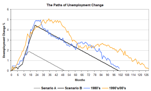
Firstly, we’ll have a Scenario A. This “best case scenario” assumes that our unemployment rate has effectively peaked and that it will soon start to decline at the average rate of the two previous recoveries – about a 0.057% decline in the unemployment rate per month.
Secondly, we’ll have a Scenario B. This is a “worst case scenario” where the unemployment rate grew to the 8.5% Treasury was initially forecasting – which would be a change of 4.6% on our chart since we started with an unemployment rate of 3.9%. We’ll also assume that the change in the unemployment rate would grow at the average rate of the previous two downturns, and that the recovery in unemployment would also be the same as the average of the previous two downturns.
This is what the two previous downturns plus our two scenarios look like:
Under our best case scenario (the grey line), it will take us over 2.5 years to recover back to the position we started from. Under our worst case scenario, where unemployment hit Treasury’s initial forecasts – our unemployment rate wouldn’t recover fully until 2016.
Remember, these charts are only for explanatory purposes – the unemployment lines will wander in reality for all sorts of reasons from domestic economic issues through to broader global growth levels – but they highlight the basic trends we see with downturns, and one that we will inevitably see with our current situation.
The purpose is to highlight the importance of time with unemployment. For every job that the stimulus hypothetically saved – it didn’t just save it for a single year. In some cases it will have saved that job every year, for 5 years or more in net terms.
But it doesn’t stop there.
Not only is the nostrum that “each job saved cost $X” utterly facile once you take the reality of time into account, it also completely ignores the opportunity costs involved – the costs that you would have had to spend anyway were unemployment higher.
The costs here are not only taxpayer costs such as higher welfare payments plus the inevitably higher government expenditure on labour market programs that high unemployment rates generate in Australia, but also the loss to GDP – the GDP we don’t have as a result of idle labour compared to the GDP we would have if that labour were engaged in paid employment.
When you dump a bucket of money into an economy like the government did, it has consequences – there is simply, absolutely no “debate” on this from anyone that can find their economic arse with a map, a GPS system and a set of directions.
The only real debate – and lets be blunt here, it is THE only REAL debate here – is over whether the squeeze is worth the juice, whether the costs are worth the benefits. Yet on this question, the popular cliché of “each job saved cost $X” is not only worthless, it is comprehensively dishonest to boot.




Crikey is committed to hosting lively discussions. Help us keep the conversation useful, interesting and welcoming. We aim to publish comments quickly in the interest of promoting robust conversation, but we’re a small team and we deploy filters to protect against legal risk. Occasionally your comment may be held up while we review, but we’re working as fast as we can to keep the conversation rolling.
The Crikey comment section is members-only content. Please subscribe to leave a comment.
The Crikey comment section is members-only content. Please login to leave a comment.