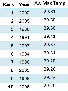
Last week the World Meteorological Organisation announced that 2009 is shaping up to be Australia’s third hottest year on record (since 1910). That got me wondering what the rest of the top 10 were, so just in case you were wondering too, here they are:

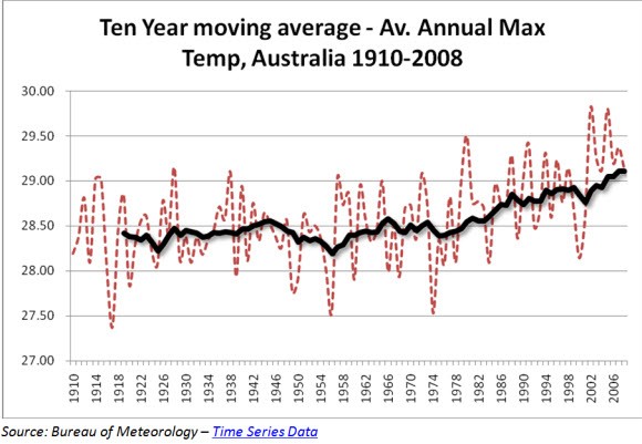
I know that’s not graph pr0n, so for aficionados of the chart, here’s the complete set with a decade long moving average. Things do seem to be hotting up down under.


But surely Tamas has proved that it’s just not happening.
It is extremely important that we understand what is happening as a consequence of the increase in CO2 due to humans, this graph and these figures need additional information to ensure they can be relied upon. I know that this is not always possible in brief articles, but I would like some information regarding the comparison of temperatures taken in ‘Australia’ in the 1900’s and those taken currently. Presumably for instance there is now more monitoring of temperatures in central and coastal Australia than there was then. Are we only looking at the same monitored points for each time. Secondly, I would imagine (but do not know) that temperatures in cities have increased as they have got larger due to increased use of building materials. Would this have an effect on averaging ‘Australian’ temperatures. People have never been more motivated to make changes for the sake of the planet, and it would be disaster if that motivation is lost as a consequence of poor science.