Our good mate Andrew Bolt — that paranoid bloke that reckons you lot might try and stick calculators up his bum — has been a very naughty boy lately. And yes, it involves his special charts.
The problem, unfortunately, isn’t a particularly unique one — a lot of this pseudo-statistical arsehattery that gets passed off as evidence in any climate change debate (or any debate that contains numbers and lots of politics, sadly) tends to come from the loudest voices involved in that debate … which also generally happen to be the most ignorant.
Not that they’ll ever admit that of course — on the contrary, as Andrew Bolt said to Annabel Crabb on Insiders (University of East Bumcrack Edition) about climate change:
At least I study, I study it, you don’t — so perhaps you’ll let me finish my point until you know something about it.
He “studies” it! Hallelujah!
The only thing that could have made that little episode funnier is if Annabel pre-empted Kanye and gave Bolt a “Yo, Andrew, I’m really happy for you and I’mma let you finish, but…” moment.
Yet there’s a serious point to all this. Andrew Bolt doesn’t have any professional training or qualification in the science or the maths — he’s not a statistician, he’s not an econometrician, he’s not a climate scientist — but he reckons he “studies” it none the less and that’s apparently enough to make him some self-appointed public expert in the Australian media space — in the same sort of way I suppose that watching Grey’s Anatomy makes you a surgeon.
But when people try to punch above their knowledge weight like Bolt does, they often end up getting it wrong in some way — be it from some large, generic error based on a misunderstanding of the data, through to much smaller errors involving the actual context of any data itself, like its certainty, for example.
The other problem is that they are easily fooled by others — lacking any professional capacity to critically analyse info they are fed or have “studied”, they become effective victims to any old horsesh-t that might be floating around. The errors or questionable work of others becomes too easily and too often integrated into their own output.
A good example of this is something I found Andrew Bolt using the other day — in fact, it’s one of his favourite, most regularly reproduced graphics.
This is the chart as he posted it from last month:
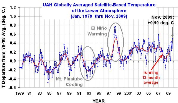
It shows satellite based global temperate data, but in a format where each month’s actual global average temperature measurement is converted into the difference between that global average temperature observation and the long run average between the years 1979 and 1998. The full data set can be found here.
Bolt uses this chart as evidence for his claim:
Did they suddenly think to check the satellite data — and discover (Good God!) that the planet hasn’t warmed since at least 2001.
Try and overlook the obvious fact that this particular chart doesn’t actually, statistically support Bolt’s claim at all — we’ll write that off as just another example of the more obvious pitfalls involved when someone attempts to punch above their actual skill level.
The reason he’s claiming what he is, comes from the behaviour of that 13 month moving average — the red trend line — where it was showing a recent decline, at least relative to where it was over the last few years or so.
The problem though with that 13 month running average, at least as far as Bolt’s argument is concerned, is that it’s starting to head sharply up — to the point where even Bolt’s blatant misinterpretation of the meaning of that red trend line is not going to support his “no warming” argument for much longer, let alone the “global cooling” argument he often substitutes in its place.
Skip forward a month, to last Saturday, where he reproduced the graphic again to support his argument “”the planet has kept cooling since at least 2001” — but this time there’s been some hokey pokey going on of the type where, were something similar done by a professional in any comparable commercial analysis capacity, the analyst would be in danger of being sacked for engaging in misconduct.
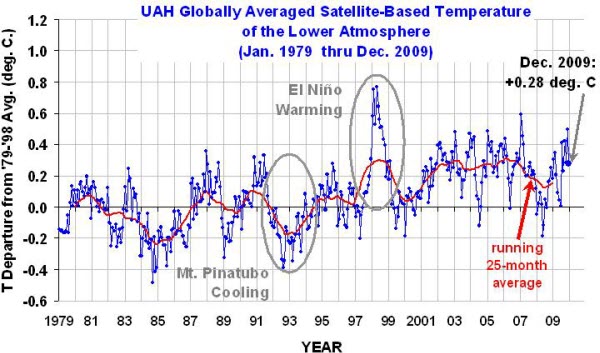
The 13 month moving average in the previous chart — the one showing a steep incline over recent months — has been conveniently replaced by a much more ideologically friendly 25 month moving average. An average that, because of the longer period of time used to calculate it, still covers all of the 2007/08 decline, artificially lowering the most recent values of the trend line.
Rather than deal with the reality of the data in a consistent fashion, the methodology used to calculate the trend was altered in such a way that it conveniently lowered the most recent values of the trend line — also conveniently allowing Bolt to continue to use this chart as so called ‘evidence’.
This is worse than curve fitting, it’s worse then cherry picking — it’s an exercise in misrepresenting manipulated data to fit an argument, knowingly or not.
If we focus on the period at the end of those two charts – this is what the difference between the old 13 month and the new 25 month average looks like (EDIT: Just to avoid any confusion — this chart below is mine, designed specifically so that the size of the difference between the two running averages can be clearly seen):
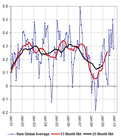
Quite a difference — a very convenient difference as it turns out.
It needs to be emphasised that Andrew Bolt didn’t create these charts — he merely lifted them from this dude.
So he isn’t to blame for the shenanigans going on with the actual charts themselves — if he really was skilled in this area, he’d crunch his own numbers. But it’s a really good example of the sort of mistakes that are made when someone pretending to be an expert attempts to punch above their actual knowledge weight — they are often taken along for a ride, because they don’t have the skills to know any better.
The irony here is that Bolt has been banging on about the “tricks” used by the (insert ominous music) “CLIMATE GATE” scientists as being damning evidence of their complicity in some global warming conspiracy — yet here we have Bolt falling victim to a far more outrageous manipulation of the data than any statistical operation used by the East Anglia folks when they joined disparate datasets together.
Which begs the question — if Bolt is so easily fooled, why does the ABC or any media outfit attempting to be informative use him? Tabloids I can understand — they’re rubbish from arsehole to breakfast time in the serious debate stakes, it’s entertainment not serious news and analysis. But the ABC?
It’s not only a sad indictment on what passes for quality debate on public affairs in the MSM in Australia, but it’s also a massive slap in the face to the intelligent conservatives and those from the intellectual right who end up having their political views represented in the public sphere by what amounts to a form of mediocrity. A result, mind you, that was always going to be inevitable when the pursuit of “political balance” on these programs transformed into a lazy affirmative action program for pundits with conservative leanings.
Conservatives and those on the right deserve better from our flagship current affairs programs – it’s not like we have a shortage of professionally skilled, media friendly folks from the right. A quick look through the halls of the IPA and CIS demonstrates that pretty clearly.
Join in the comments and discussion here


Crikey encourages robust conversations on our website. However, we’re a small team, so sometimes we have to reluctantly turn comments off due to legal risk. Thanks for your understanding and in the meantime, have a read of our moderation guidelines.