There were 2203 separate stories analysed across 10 newspapers between September 7 and 11, 2009 to determine whether they were initiated by public relations or promotions. The study found that nearly 55% of stories analysed were driven by some form of public relations — a media release, a public relations professional or some other form of promotion.
The 10 newspapers were the hard-copy editions of The Australian Australian Financial Review, The Advertiser (Adelaide), The Courier-Mail (Brisbane), Daily Telegraph, Herald Sun, The Mercury (Hobart), The Australian, The Age, Sydney Morning Herald and The West Australian.
Here’s what came out in the wash:
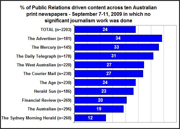
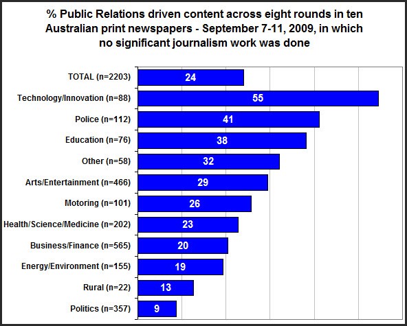
UPDATED 18/03 to correct a typo in graph 3







Stacked bar graphs where the total is also stacked on top of its constituent parts. I suggest a visit to some of the rather good data presentation blogs – try FlowingData and “information aesthetics” .
That over a half of what is in the papers is pre-packaged spin does not surprise me, it is just another example of out-sourcing.
Trash1,
The components weren’t mutually exclusive in every category, so standard stacked charts don’t work.
For extra points, write a PR article that hits every category.
Perhaps the muddy red bars should have been alongside the stacked blue and black. It does appear deceptive to stack the total on top of the components. As an engineer I would be well busted if I tried it.
There are lots of different ways of doing graphs. They are changed now to show the two components without the total displayed separately, so these comments are out of date . It is all a matter of choice and far from the core issue.