Tucked away in Budget Paper Number 1 is a fascinating little chart that is arguably the most politically important piece of data in the entire budget, as it justifies not just the very existence of the stimulus program and the political baggage that is coming with it, but also shows the likely consequences of the alternative “what if the stimulus was smaller or didn’t exist” scenario.
You can see the Treasury version of the chart over in Statement 2 of Budget Paper No. 1 – “Box 4: Economic growth and fiscal stimulus”. However, that treasury graphic is a bit of a chartcrime, so we can reproduce it ourselves from the raw data cited in the budget papers.
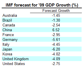
Back in early 2009, the IMF made GDP forecasts for a number of countries based on what the prevailing economic outlook was for those countries at the time that the forecasts were made. Those early 2009 IMF forecasts came in like this:
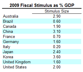
During the period between when these forecasts were made and today, these nations deployed fiscal stimulus packages of varying sizes. You can see the size of the stimulus packages as a proportion of GDP in the table on page 36 of this IMF document – under the 2009 column “Crisis related discretionary measures”. This was the size of the stimulus packages for each of these nations as a proportion of GDP:
The third and final piece of data we need is the actual growth achieved by these nations in 2009, which the IMF also provides over here.
This is what they come in as (using last night’s Treasury data to substitute for the Australian entry):
So what was the impact of the stimulus on GDP growth across nations? To find out, if we subtract the 2009 IMF forecast growth from the actual growth achieved in 2009, it tells us the forecast error – or the amount by which the original GDP forecast for each nation was out.
That then allows us to compare the size of the various stimulus packages to the size of those forecasts errors via a scatter plot and regression – if the stimulus packages explain the forecast errors (in that, the bigger the stimulus package, the better the economy performed over its original forecast), then we should see a tight linear relationship with nations starting in the bottom left hand corner (representing small stimulus and small errors) going roughly linear up until the top right corner (representing large stimulus creating large forecast errors).
So what does the chart look like?
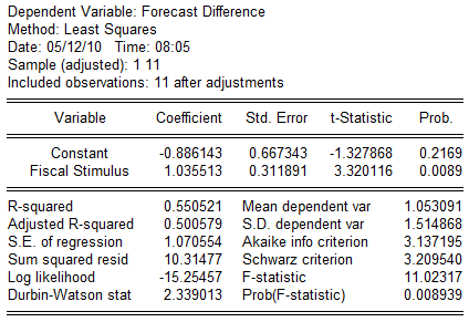
This is a very statistically significant relationship (albeit with only 11 observations), with the budget papers stating that the T-stat on the stimulus package coefficient was 3.3. Using the raw data, my results confirm that – here’s the regression output:
What this chart demonstrates is that the size of the stimulus packages mattered – seriously mattered. The larger the stimulus package, the better a country performed compared to what its original IMF growth forecasts suggested.
The stimulus packages made a clear difference to the size of GDP growth. The size of the packages made a clear difference to the size of the effect on GDP growth.
As the effect was consistent across nations – we can use this data to get an approximate estimate of what actual Australian GDP would have looked like in 2009 as a function of the size of a spectrum of stimulus package sizes.
If we treat the regression line in the above chart as an approximate estimate of the stimulus effect on GDP, we can slide Australia up and down that line according to hypothetical stimulus packages of different sizes, and recalculate the left hand vertical axis to represent Australian GDP rather than the forecast error.
According to IMF data and the consistency and significance of the stimulus/forecast error relationship, a stimulus package in Australia around the 2.2% of GDP would have given us zero growth – anything less than that would have delivered us negative growth.
When the Coalition says the stimulus package should have been smaller – they need to be asked how much smaller. Every drop in GDP causes an increase in size of unemployment. How many more people would they have been willing to throw on the scrap heap of unemployment in their pursuit of a smaller package?
Every time the Coalition complains about debt, they need to be asked how much smaller they believe the stimulus package should have been and how many more people would they have been willing to throw on the scrap heap of unemployment in their pursuit of a smaller debt load.
Debt was the cost of growth – growth was and always is the provider of jobs. Pretending that less debt could have provided the same jobs is fairy floss economics. A dollar is a dollar is a dollar.
The size of stimulus packages mattered – the international evidence is in.
The Coalition needs to be questioned about its economic viewpoints – viewpoints which are far from mainstream economics, existing on the very fringes of economic debate and which are completely at odds, completely and utterly at odds, with the international empirical evidence.
You know what an argument without evidence is called?
Making shit up.
UPDATE:
Sinclair Davidson (which some of you may remember from one of the funniest exchanges in Senate Estimates history with Doug Cameron!) over at Catallaxy has redone the same chart with more than just this G7 plus selected countries, but expanded it to the whole G20, finding much more variation in the results, leading to a crashed significance and much reduced slope on the regression line over the full G20 spectrum.








Crikey is committed to hosting lively discussions. Help us keep the conversation useful, interesting and welcoming. We aim to publish comments quickly in the interest of promoting robust conversation, but we’re a small team and we deploy filters to protect against legal risk. Occasionally your comment may be held up while we review, but we’re working as fast as we can to keep the conversation rolling.
The Crikey comment section is members-only content. Please subscribe to leave a comment.
The Crikey comment section is members-only content. Please login to leave a comment.