For that’s exactly what happened in the WA town of Ravensthorpe between the 2003/04 and 2007/08 financial years – driven by the construction and opening of the BHP Ravensthorpe nickel mine. Sadly for the residents of Ravensthorpe, the mine was mothballed shortly after opening as a result of weak nickel prices – but it highlights the nature of the massive growth in incomes over the period in small WA towns that really stood out in yesterdays ABS release Estimates of Personal Income for Small Areas.
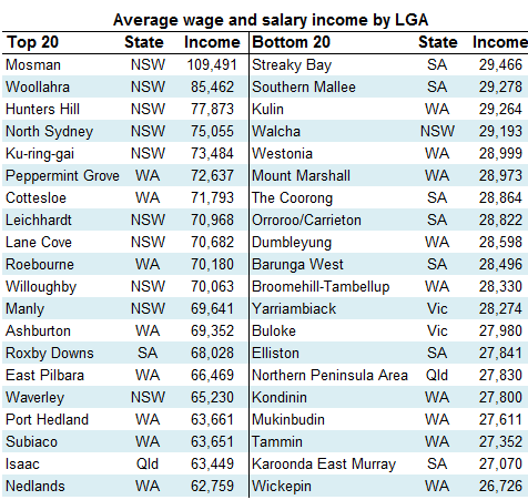
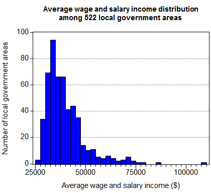
The ABS publication tracked a number of income measures across the financial years starting in 2003/04 and ending at 2007/08 for over 500 local government areas in Australia. If we look at the top and bottom 20 local government areas for average annual personal wage and salary incomes for the 2007/08 financial year, it shows the usual suspects turning up – we’ll also throw in a histogram of the distribution of average wage and salary earnings for the 522 local government areas as well.
We get the usual Mosman, Woolhara and Hunters Hill type areas coming in at the top, with a collection of boondocks coming in at the bottom. We also see a pretty standard income distribution skew for a country like Australia with a longish right hand tail.
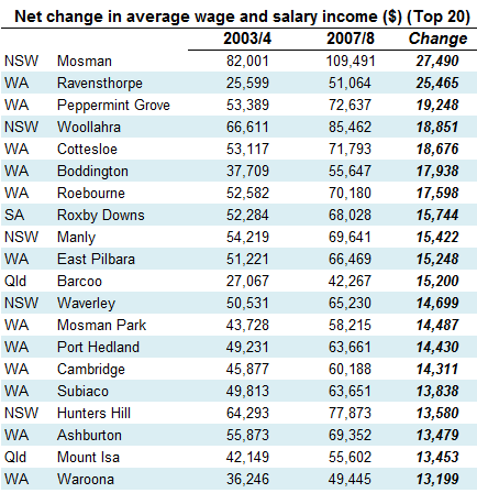
But more interesting is the way average wage and salary income changed over the four year period, particularly the geographical distribution of where the biggest changes occurred. If we firstly look at just the net dollar changes in average wage and salary earnings for local government areas, we start to see the big mining areas pop up as some of the largest net dollar movers:
It’s a pretty good representation of the boom sectors of the Australian economy over the period, with the top end white collar areas of Mosman and Peppermint Grove etc making the big dollar gains on wages and salaries, along with the big mining areas of the Pilbara and Mount Isa etc. Also noteworthy is that 12 of the top 20 LGA areas experiencing the largest net increase in average wage and salary earnings are in WA.
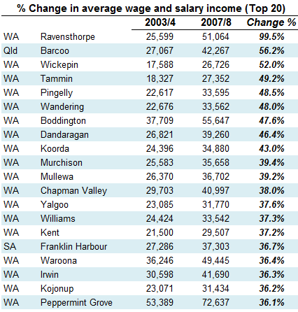
While this fairly interesting, if we run those numbers again, but rather than look at the net changes in average wages and salaries, we look at the percentage change that occurred in average wage and salary earnings – the growth rate in wage and salary earnings in LGA areas – something extraordinary happens.
Welcome to the WA mining boom! 18 of the top 20 local government areas across Australia that experienced the largest wage and salary growth were in WA, and 19 out of 20 occurred as a result of the resources boom (including Franklin Harbour in SA where the Iron Duke mine draws a large number of its employees from). As far as I can tell, only Peppermint Grove in WA was not directly reliant on mining driving wages among the top 20 – although a significant proportion of Peppermint Grove workers would either work in the white collar end of the resources industries, or work for companies supporting the resources industry.
The mining boom is roaring back after its 12-18 month hiatus – so we should start to see this effect happening more and more often, not only in WA, but also Qld and to a lesser extent SA. It’s pretty astonishing.
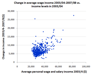
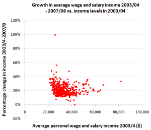
Finally, it’s worth running two scatterplots. One where we chart the average wage and salary income in LGAs in 2003/04 against the net dollar change that occurred in those average wage and salary incomes for the 4 years to 2007/08, and another where we charrt the same 2003/04 income against the percentage change in that income that occurred over the 4 years to 2007/08 (click to expand – net dollar change in is blue, percentage change is in red)
While the first chart shows that LGAS with higher base levels of wages and salaries in 2003/04 generally experienced higher net increases in those wages and salaries over the 4 years to 2007/08, the second chart actually shows that it wasn’t disproportionally so, in that the rates of growth for LGA’s that had higher wage and salary incomes in 2003/04 wasn’t particularly larger than the rest. So while the rich areas were generally getting richer in terms of wages and salaries, their rates of growth weren’t particularly higher than what was happening, on average, everywhere else.
UPDATE:
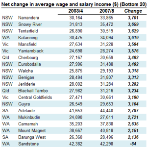
As for the bottom 20 by both total wage and salary increase and the percentage change, here they are (click to expand):





Crikey is committed to hosting lively discussions. Help us keep the conversation useful, interesting and welcoming. We aim to publish comments quickly in the interest of promoting robust conversation, but we’re a small team and we deploy filters to protect against legal risk. Occasionally your comment may be held up while we review, but we’re working as fast as we can to keep the conversation rolling.
The Crikey comment section is members-only content. Please subscribe to leave a comment.
The Crikey comment section is members-only content. Please login to leave a comment.