A funny little thing about the Greens vote popped up last week when I was trying to estimate the size of the donkey vote at the recent election. Where the Greens candidates sit on the ballot paper has an impact on the size of the vote they receive, beyond a standard donkey vote.
Essentially, the closer to the top of the ballot a Greens candidate was, the larger was the change (on average) in the primary vote the Greens received – so Greens candidates closer to the top of the ballot got a larger swing towards them than Greens candidates at the bottom of the ballot.
The pattern operated in such a way that even if we remove all of the seats where the Greens were 1st on the ballot paper (the standard donkey vote), we still see the same relationship play out.
As regularly happens with these things, I initially stumbled across it by accident. As also regularly happens with these things, I initially thought it was just a quirky little spurious correlation of the type that we regularly see in social science data. Correlation is sometimes simply accidental with this stuff.
Yet the relationship was particularly strong and it kept bugging me – so I went back through previous elections and found the same, exact pattern. What differed over the last 3 elections for the Greens was the strength of the relationship, but not the direction or nature of the relationship itself.
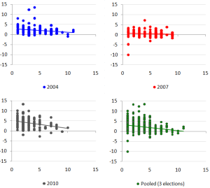
To start with, let’s just run 4 scatter plots of the ballot position of Greens candidates against the swing they received for the 2004, 2007 and 2010 elections using seat level data, as well as a scatter plot of those three election results all pooled together. The bottom axis is ballot position (whether they were the first, second, third candidate on the ballot etc), while the vertical axis is the swing received. (click to expand)
What we notice is that the 2007 result, while still having a slight linear trend in the right direction, is pretty weak (both visually and statistically). The 2004, 2007 and pooled results however, are all statistically significant.
But if the general relationship between ballot position and swing was true, would we expect the relationship in 2007 to be weak?
Well, yes, we probably would. The reason why we would expect such a thing is because of the underlying variation in the data. In both 2004 and 2010, the Greens experienced a sizeable national swing towards them – 2.23% in 2004 and 3.97% in 2010. Yet in 2007 they experienced only a very small swing of 0.6%.
Similarly, if we look at the variance of the swings at the seat level, the standard deviation of the swing in 2004 was 1.96, in 2010 it was 2.48, while in 2007 it was a lowly 1.32.
So in both 2004 and 2010 there was not only a large swing, but larger variance underneath those swings compared to the 2007 result. To track relationships between data, you need variation in the data itself. With relatively small variation in the 2007 data, we would generally expect to see a weaker relationship if such a relationship was actually true.
If we pool the results from all three elections, what we find is that even though the 2007 result in isolation shows a weakish relationship, when pooled with the higher variance 2004 and 2010 results, the pooled result still exhibits a relatively strong relationship. Interestingly, if we look at this pooled result – we can control for the standard donkey vote to see if it’s just the first position on the ballot that matters or if it’s something deeper.
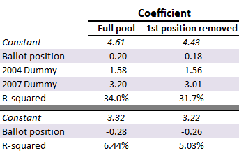
To do this, we’ll create two sets of data – the first being the full pooled results of all three elections, the second being the same as the first except that we’ll delete from the sample all the data where the Greens came 1st on the ballot paper (effectively removing the donkey vote in its entirety). We’ll then run two regressions on these two data sets – the first where we’ll use ballot position, a dummy variable for 2004 (showing us how the 2004 result differed from the 2010 result) and another dummy for 2007 (showing us how the 2007 result differed from the 2010 result) and see how it explains the Greens swing by electorate.
The second regression, we’ll just ignore the dummy variables and look at a straight Greens swing as a function of ballot position for the two data sets.
If the regression results are similar for the two data sets, it will tell us that the standard donkey vote isn’t driving the relationship. The results look like this:
The p-values are all less than 0.001 for all the variables, so the results are highly statistically significant. We also had 450 observations worth of data.
What we find is that the values on the coefficient for the “Ballot position” variable (which tells us how much the average swing changes for every one position change in the ballot paper) are only different in their values by a very small amount. So for the full pool that includes the donkey vote and our 2004 and 2007 control variables, every one position further down the ballot a Greens candidate was, the swing reduced by an average of 0.2%. With the donkey vote removed, the swing reduced by 0.18% for every one position further down the ballot paper – a difference that is next to nothing, suggesting that the donkey vote wasn’t driving the relationship. The second regression is mostly meaningless, but it’s worth throwing in to show that even in the messy pool where we don’t control for each election result, we still end up with a very small difference on the coefficient for ballot position, and the explanatory power we’re talking about here isn’t enormous – it’s only a small fraction of the voting population driving the behaviour. So it’s relatively small overall and between 5 and 10% for 2004 and 2010 elections.
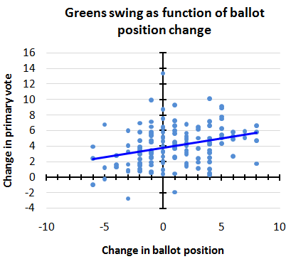
Instead of looking at just ballot position vs the change in the primary vote – let’s also have a squiz at the change in the ballot position between the 2007 and 2010 elections compared to the change in the primary vote between those elections – effectively comparing change with change.
To explain the change in ballot position, let’s use the seat of Adelaide as an example. In 2007 the Greens were position 1 on the ballot – the top of the ballot paper. In 2010, the Greens were on position number 7, the bottom of the ballot paper. As a result, the Greens were 6 positions lower on the ballot paper in 2010 than they were in 2007 – giving us a ballot difference of minus 6.
So negative ballot differences represent moving down the ballot paper, positive ballot differences represent moving towards the top of the ballot paper. If we then compare that ballot difference to the swing the Greens received in 2010, this is what we end up with.
The bigger the movement towards the top of the ballot, the larger was the average increase in the primary vote. Conversely, the bigger the move down the ballot paper, the smaller was the average increase in the primary vote. Again, statistically significant and explaining about 9% of the total variation in the swing – not large, but still meaningful.
In those seats where the Greens moved higher up the ballot paper in 2010 compared to where they were in 2007, they had an average swing of 4.4%. In those seats where the Greens moved down the ballot paper in 2010 compared to where they were in 2007, they had an average swing of only 3.1%.
So we see not only ballot position having a relationship with the Greens primary vote swing, but also the change in ballot position having the same type of relationship with the Greens primary vote swing.
Looking across all the evidence, maybe it is just “a fluke” – but it would be a pretty astonishing fluke of the type that is really starting to press against the bounds of statistical possibility. If we witnessed this behaviour, at this strength, in any other field – it would pretty much be accepted that the evidence is suggesting some underlying dynamic worth attempting to explain.
Something appears to be going on – but more importantly, it seems to be only going on with the Greens vote as we don’t see these consistent results when we look at the ALP or Coalition primary vote swings as a function of ballot position.
So what could possibly be responsible?
Why would more people change their vote for the Greens, on average, in any given electorate between any given election, when their candidates are closer to the top of the ballot paper?
Is it some sort of weird psychology issue? Perhaps there are a group of people who are predisposed to making decisions based on the earlier information they receive rather than the later information they receive – so when they read the ballot paper, the first information they receive is towards the top of the paper (since it’s read from top to bottom). Perhaps those voters with an information timing skew prefer the Greens at a higher rate than the wider population?
Perhaps ballot position becomes a subconscious influence on indecisive voters – so when stuck between choosing one of 2 or more generally preferred alternatives, the choice closest to the top ultimately gets chosen at a higher rate – and perhaps the Greens are in that mix among this indecisive cohort at a higher rate than the wider population?
To be blunt, I have absolutely no idea! 😛 I’m hoping you lot do.
—
On something completely unrelated, but none-the-less interesting and equally quirky , I found an interesting pattern between language and the absence of religion in the census data at the electorate level. It speaks more about the dynamics of how different types of communities form and who lives in them, than it does about any necessary causation (though there might well be a bit of that going on).
If we look at the proportion of every electorate that described themselves as having “no religion” in the census and compare that to the proportion of each electorate that was born overseas in a Non-English speaking country on the one hand, and the proportion of each electorate that was born overseas in an English speaking country on the other hand – we find a strong positive relationship between one group and strong negative correlation between the other.
Impressively odd!





Crikey is committed to hosting lively discussions. Help us keep the conversation useful, interesting and welcoming. We aim to publish comments quickly in the interest of promoting robust conversation, but we’re a small team and we deploy filters to protect against legal risk. Occasionally your comment may be held up while we review, but we’re working as fast as we can to keep the conversation rolling.
The Crikey comment section is members-only content. Please subscribe to leave a comment.
The Crikey comment section is members-only content. Please login to leave a comment.