“The time has come,” the Walrus said, “to talk of many things” — but we’ll start with our new polling trend measures.
You may remember that last term we had two trend measures — the all pollster trend (which was an aggregation of the results of every pollster) and our phone pollster trend (which did the same thing, but just with phone polls). The all pollster trend line was consistently more pro-Labor than the phone pollster trend line because of the relatively pro-ALP lean of Morgan’s face-to-face polling.
This term, rather than run two separate measures, we’re just going to run one. As a result, we won’t be using Morgan’s face-to-face polls in our vote estimate measures at all — though we’ll still take a look at any issue based polling that might come out of them as they are still valuable.
So the pollsters we’ll this term for our trend estimates will be Newspoll, Nielsen, Galaxy, Morgan’s phone polls, Essential Report and any other phone poll that might pop up.
The trend line mechanics run much as they did last term. First we take the raw polling data for each pollster.
Second we create a new series where each observation is made up of the average of the most recent raw polling result from each pollster and weighted by sample size. So if we had two polls where one had a sample size of 2000 and the other had a sample size of 1000, the poll result with a sample size of 2000 would have twice as much say as the poll result that only had a sample of 1000.
Finally, we run a locally weighted polynomial regression through this new series to get our trend line.
However, the one small difference this year is our treatment of Essential Report.
As its voting intention results are already averaged over two weeks, and because they run off relatively large samples often more than 2000, we don’t want them to dominate the aggregated series — so we are going to give the Essential Report results a weight that is equivalent to a constant sample size of 1000.
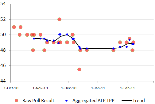
To see how the mechanics of it all play out, we can chart the raw two party preferred poll results for the ALP since October (the red circles), the aggregated poll series (the dark blue dots) and the trend line that we run through our aggregated series (the black line).

It took a while for enough polls to come in from enough pollsters to enable us to start our aggregated series mid-October. You can see how the variation of the aggregated series is much smaller than the variation in the raw poll results. The reason for this is that the aggregated series knocks out a lot of the noise of the sampling error.
When we run the trend algorithm through it, it attempts to look through even more of the residual noise.
The other thing we will do when we get a few more months of polling observations is not only weight the aggregated series by sample size, but also by time — treating a poll that is, for example, released today with more importance than a poll that was released two weeks ago.
Effectively, we’ll be weighting information not only on the basis of its sampling uncertainty (sample size), but also on the basis of its temporal uncertainty (newer polling information is more valuable than older polling information).


Crikey encourages robust conversations on our website. However, we’re a small team, so sometimes we have to reluctantly turn comments off due to legal risk. Thanks for your understanding and in the meantime, have a read of our moderation guidelines.