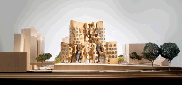
I don’t know why the proposed Gehry-designed Dr Chau Chak Wing building at UTS looks like a microwaved chocolate castle, but it certainly does “bizarre” to a T. It’s unusual, unconventional, strange, odd, extraordinary……it’s everything you’d expect to get when you buy Gehry.
I’ve been an admirer of Frank Gehry ever since I first saw an article about the superb house in Santa Monica he designed for himself and his family earlier in his career. It’s not generally known that Gehry had quite a measure of fame in architectural circles well before he hit the big time with the Guggenheim Bilbao in the late 90s.
I can’t know for sure, but the new premises for the Business School certainly looks like it could be awfully expensive. Emulating all that squashed plasticine – or ‘crumpled brown bag’ or ‘broken pottery’ – could cost a pretty penny. This report in the Sydney Morning Herald suggests it might. The story says the new building for Sydney’s University of Technology is expected to be completed in early 2014, provided:
the university and its builder can work out how to lay bricks in keeping with the design of wildly unconventional angles that typify many of the architect’s buildings. “The undulating brickwork of the east facade is a complex structure and one of the key project challenges,” conceded Nigel Oliver, the director of UTS’s program management office. “We have been working closely with the project team and facade contractors to find the best way of building a physical structure that reflects Gehry’s vision.”
It surprises me that any university would be constructing a high-cost building like this in these financially straitened times in the higher education sector. Then again I hear UTS is flush with cash owing at least in part to some wise or lucky investment decisions in the past. Moreover Frank Gehry has a reputation for financial responsibility, so while the design might be inherently costly, it’s not likely to turn into another Opera House with a 1400% budget overrun.
I’ve no reason to doubt Gehry is as responsive to his client’s needs as any other architect, but modern clients don’t pay the Gehry premium because they’re looking for functional perfection. Clients go to “starchitects” like Gehry for marketing reasons. They want to be noticed.
UTS might, for example, think it will lift the university’s brand with the overseas and domestic student markets. Or perhaps the administrative and academic staff think it will enhance the institutions general reputation in the national and international university status race.
I wonder if any such expectations will be fully met. While there’s always going to be something special about any Frank Gehry building – and he is a brilliant architect there’s no two ways about it – there’re quite a few “Gehry’s” scattered around various cities now. It’s not like UTS is getting a Sydney Opera House or a Bilbao Guggenheim. The Dr Chau Chak Wing building will have cachet but maybe not as much as UTS hopes.
I think the proposed design is visually arresting – as it’s meant to be – but I don’t find it especially exciting or, more importantly, satisfying. For one thing, it’s a little too reminiscent of other Gehry buildings to be really electrifying or thrilling. It might be argued that all Frank Lloyd Wright’s prairie houses look similar too, but starchitecture is a new and different game – it’s brand identification. Uniqueness matters.
For another, it’s not obvious to me how the “blitz aesthetic” of this design – or whatever one chooses to call it – relates to UTS’s mission or to the location. I like an underpinning theory or rationale for virtually everything and in this case I can’t see what it is. If there’s a theory there, I don’t get it.
According to the UTS PR blurb, the design is inspired by “the concept of a tree-house structure”. It’s “a cluster of ‘tree houses’ or vertical stacks of floors with spatial ‘cracks’ in between”. Just why tree houses and cracks makes sense for this particular function in this particular location is anyone’s guess. That’s not ‘a theory’ in any meaningful sense – it’s more of an analogy. In any event, it certainly doesn’t look much like a tree house!
Notwithstanding some desultory references to local brick and sandstone building materials, there isn’t much of a sense of place to this building either so far as I can see. It could be built pretty much anywhere. It’s truly an international design. Maybe that’s what Gehry’s clients want.
Naturally there’s the customary long list of sustainability initiatives in the PR blurb, as if they’re something extra special rather than something we should be able to take for granted. Both Gehry and UTS are probably a little sensitive to any criticism that the expressionistic design has compromised sustainability.
Much as I like Gehry (and he comes across as an engaging fellow) I’m disappointed UTS felt it necessary to commission a “starchitect”. That ruled out the local talent immediately. It gave priority to architecture as marketing. That might be OK for a corporate building but this is a public building. I also think it’s dangerous because a building is a pretty risky way to go about marketing. It costs a lot and you have to live a long time with the design compromises.
Of course there’s always been a tradition of innovation in architecture – “the shock of the new” and all that. The trouble is I don’t think of this design as innovative. It’s more about wanting to be “different” for the sake of it. And I don’t think it’s a complete success on that score anyway.
But most of all I can’t help thinking UTS should be more prudent with its spending. Good architecture isn’t about spending a lot more. It’s about optimising brilliantly and creatively subject to constraints.


Crikey is committed to hosting lively discussions. Help us keep the conversation useful, interesting and welcoming. We aim to publish comments quickly in the interest of promoting robust conversation, but we’re a small team and we deploy filters to protect against legal risk. Occasionally your comment may be held up while we review, but we’re working as fast as we can to keep the conversation rolling.
The Crikey comment section is members-only content. Please subscribe to leave a comment.
The Crikey comment section is members-only content. Please login to leave a comment.