You have until end of the month (July 1, but) to catch the most exquisite show in town, no contest. Love and Devotion (free) at the State Library on Swanston presents nearly 70 illustrated manuscripts from Persia, and India and Turkey, on loan from Oxford’s Bodleian library — it’s the ne plus ultra of interlibrary-loans.
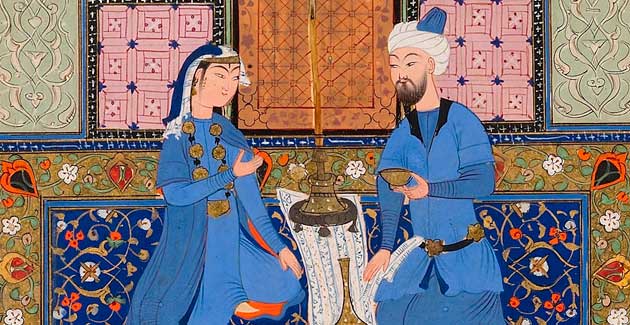
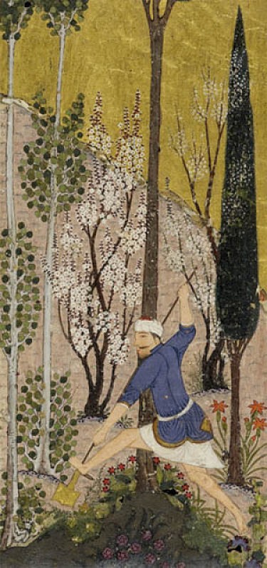
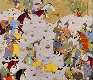
The books are shown in vitrines and some of the pages are framed on the wall; they’re small — folio book-sized. The impact of these compact illustrations is out of proportion to their scale. The scenes are utterly exotic, as if from a dream world, the detail is minute and extraordinary, the skill is mind-blowing. Looking close — if only there were no glass protection! — makes me think two things:
1) The colour choices are marvellous — the palette and harmonies are surprising in a way that the (fabulous) Celtic illustrated manuscripts or the Book of Hours are not. There’s something hot and citrusey about these Persian works, and a very contemporary sensibility, too (though the influence worked from them to us, of course) — the chrome yellow banging on the powder cobalt, the vermilion jangling against the minty eau de nile. And much of it internally patterned with geometrics or florals. Doing away with shadows allowed colours to butt up, so opposite hues pop. Matisse did not have better line or colour judgement.
2) The other thing is the tradition of flatness, the lack (refusal) of single point perspective — the shadow-free world depicted gives every scene maximum clarity while simultaneously rendering each figure and setting symbolic — the detachment from naturalism frees it from specificity.
Oil paint and perspective combined with chiaroscuro and sfumato gave the High Renaissance paintings an astonishing realism — but right now, at least, also make them feel dated, which was my feeling in the Louvre earlier this year (not least to do with varnishes having yellowed and darkened). The colours in these beautifully preserved Persians vibrate — their matt surfaces setting off the garnishes of gilt paint. A not dissimilar effect of freedom from period is seen in many Chinese scrolls — the simplicity of line, the black and white, and the multi-point perspective. Flatness as freedom.
The illustrations certainly have as much visual intensity as any small, classic Jan van Eyck (then again, hardly any picture compares with his Arnolfini) and is just about as static and hieratic in composition; compare them to the similarly small-scale Flagellation by Piero della Francesca. (One should note that both were early Renaissance, and the paintings linked here are absolute high points of art making.)
No matter, the pictures are brilliant even if the stories they tell seem mysterious and obscure without deeper study. (Look out for a delightful tree sprouting animal heads and other oddities.) There is an excellent website for the exhibition — the display of the art is exemplary with a great zoom function. But you know, seeing the thing itself — there is no substitute — so much of art depends on scale, and even if you can’t touch the objects, your eyes can do a pretty great job transmitting the tactility of the paint in the pictures, the feel of the paper. In this case, e-books really can’t do the manuscripts justice.




Crikey is committed to hosting lively discussions. Help us keep the conversation useful, interesting and welcoming. We aim to publish comments quickly in the interest of promoting robust conversation, but we’re a small team and we deploy filters to protect against legal risk. Occasionally your comment may be held up while we review, but we’re working as fast as we can to keep the conversation rolling.
The Crikey comment section is members-only content. Please subscribe to leave a comment.
The Crikey comment section is members-only content. Please login to leave a comment.