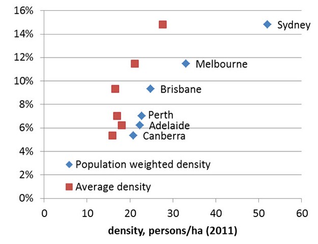
The first exhibit compares public transport’s share of motorised travel against population density in six Australian capital cities. I’ve taken it from an extensive new blog post by Chris Loader at Charting Transport.
For me, it’s a natural follow-on to my post last week, Is Los Angeles really the densest city in the US?, because it measures density in two ways: Average Density (AD) and Population-Weighted Density (PWD). The former is common enough, but population-weighted density is less familiar.
The difference between the two measures can be thought of like this: AD gives equal weight to each square kilometre whereas PWD gives equal weight to each person. That’s why AD gives us the counter-intuitive result that Los Angeles is denser than New York.
I’m not going to summarise the findings of Chris’s excellent article, Comparing the residential densities of Australian cities 2011, so I urge you go and read it. There’re a number of illuminating charts and some superb maps showing (most of) Australia’s capital cities by PWD.
I’ll confine myself to some remarks about his findings, starting with the first exhibit. It shows that, unlike US, Canadian and Australian cities taken together, where Stone and Mees found only a weak relationship between AD and mode share, there’s a stronger relationship when Australian cities are considered by themselves.
The number of cities isn’t large though. Take out smallish Canberra, which doesn’t sit well in this company, and the relationship between public transport and AD is still significant but a lot weaker. Also, public transport has a considerably higher mode share in Brisbane than in either Perth or Adelaide, even though it’s slightly less dense than both.
The relationship is much stronger when measured in terms of PWD. Brisbane is now denser than Perth and Adelaide, consistent with its higher mode share. Take out Canberra and the relationship doesn’t get any weaker (I fitted a logarithmic curve with R squared=0.943).
One of the key things PWD suggests is that mode share is positively related to the degree of concentration of population i.e. the proportion of the population at higher densities. In Australian cities, concentration effectively equates with centralisation – the vast bulk of higher density living is relatively close to the city centre.
A simple measure of concentration is PWD/AD. On this measure, Sydney’s concentration is 1.9, whereas Melbourne is 1.6, Brisbane 1.5, and the others range from 1.3 to 1.2.
Chris has another chart (his blog isn’t called Charting Transport for nothing!) which helps explain this point. It shows PWD by distance from the CBD.
Brisbane and Perth dip below 50 persons per hectare at 1-2 km from the city centre and Melbourne at around 5 km. Sydney however is like another country – it stays at or above 50 for around 15 km, with another brief uptick at 20 km.
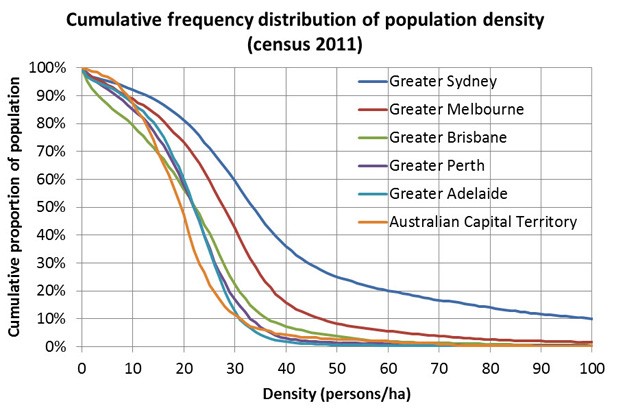
There’s also a chart I’ve reproduced here (see second exhibit) showing the cumulative frequency distribution of density. It reinforces the idea that Sydney is in another league, showing:
that 30% of people in Sydney live in densities of 44 persons/ha or more – compared to only 12% of Melburnians, 5% of Brisbanites, and less than 2% of people in the other cities.
If 15-30 persons per hectare is what you define as suburbia, then that’s 26% of Sydney, 37% of Melbourne, 44% of Brisbane, 55% of Perth, 57% of Canberra and 62% of Adelaide.
Concentration of population at higher density works directly to increase public transport mode share by, for example, increasing walk-up patronage. It also works indirectly (and arguably more importantly), by making cars less competitive due to factors like congestion and higher parking costs.
Although concentration of population is correlated with higher public transport share, it’s likely that concentration of employment is more important. Since concentrations of both jobs and population tend to be centralised in Australian cities (where public transport supply is also best), it’s not easy to unpick the relative significance of each.
Chris says he’ll look at employment when the data becomes available from the 2011 Census. There’s much more at Charting Transport (the discussion is supported by 12 maps/diagrams and a table) and it’s well worth a visit.
Update: I should draw attention to a point I’ve made a number of times before – population density is only one determinant of mode share. Note that although its PWD is twice as high, Sydney’s public transport mode share is 14.8% compared to Brisbane’s 9.3%. There are other factors like, for example, differences between cities in the supply of public transport, that should be taken into account.


Crikey is committed to hosting lively discussions. Help us keep the conversation useful, interesting and welcoming. We aim to publish comments quickly in the interest of promoting robust conversation, but we’re a small team and we deploy filters to protect against legal risk. Occasionally your comment may be held up while we review, but we’re working as fast as we can to keep the conversation rolling.
The Crikey comment section is members-only content. Please subscribe to leave a comment.
The Crikey comment section is members-only content. Please login to leave a comment.