By now you’ve no doubt heard that the parent companies of trade publishing houses Penguin Books and Random House – Pearson and Bertelsmann respectively – have combined to form the world’s largest book publisher, which will now be known as Penguin Random House.
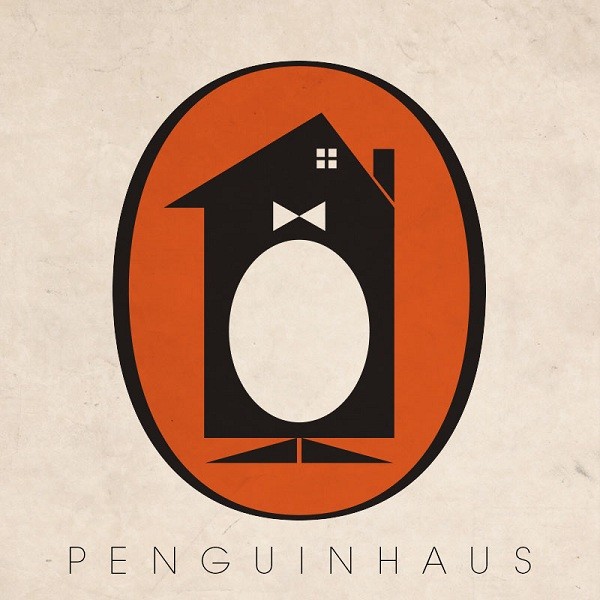
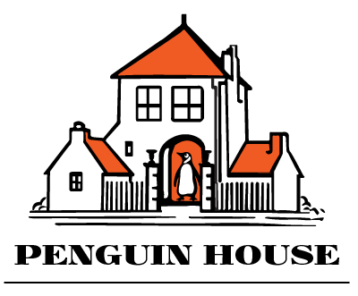
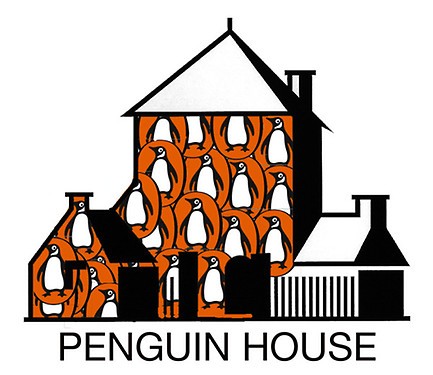
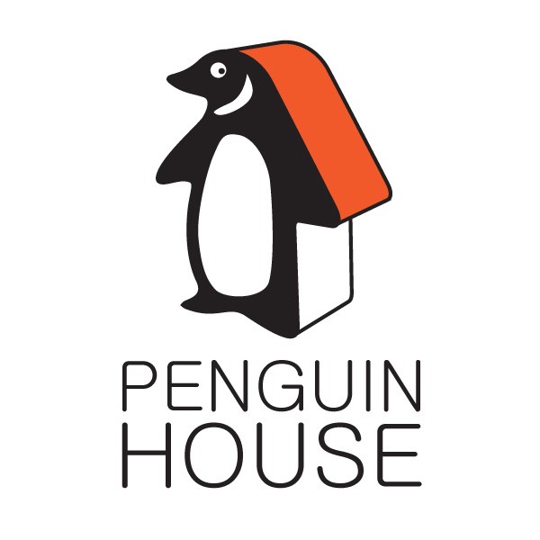
The official announcement came on Monday, following days of speculation after Peterson confirmed that the two companies had been in talks. The rumours sparked much hilarity on Twitter, with speculation as to what the new name might be – the particularly amusing Random Penguins (and the associated meme) being the favoured title, as well as Penguin House or even, wittily, PenguinHaus.
But in the far more sobering official statement, the company will now be known as Penguin Random House, and the announcement has sparked discussions about the implications for the market, for publishers, for employees, authors and agents. There is talk of the profits and the losses in the age of digital publishing, of years until the acquisition will be complete and of the share of the company each will receive.
I’m more literary- than business-minded, and talk of mergers and acquisitions simply bring to mind Patrick Bateman’s quip about ‘murders and executions’. But what I wanted to talk about was something smaller, a more affectionate but no less deeply felt loss, as a reader of Penguin books for a long time.

— Image source.
‘The myth is when you combine two great companies you get one even greater company,’ publisher Andrew Franklin said in a report in the Guardian, and predicted that Penguin will lose its separate identity: ‘This will end up a complete takeover of Penguin.’
It would be sad indeed to lose the identity of Penguin Books. There was something iconic about that logo, that orange and white slightly anthropomorphic bird who sat promisingly on the spine of old books. You can see even in the logo mock-ups embedded here – variously found on twitter and publishing news websites – that the orange and white has a hold over us.
It’s instantly recognisable, just old enough to be retro and nostalgic. You could buy mugs, journals and even aprons emblazoned with the logo – and this bookish paraphernalia sells, lining the walls of all my favourite bookstores. I can think of few other publishing houses who could successfully sell such a thing.
— Image source.
I’m not sure that we have much loyalty to publishing houses anymore. For the vast majority of readers, it’s all about who publishes which title rather than any slavish adherence to a particular brand. Only since I’ve become a reviewer have I trawled the new release lists of all the large and independent houses, and have preferences as to which I think are publishing the most exciting titles or writers.
And yet, and yet, there is a great affection for that funny penguin. It has shape shifted for many years, but the playfulness only works because it is so widely recognised, and so affectionately known. It’s a name that has carried the greatest names in literature – thankfully out of copyright restrictions so you could read any of the classics for under ten dollars.
And so, since the beginning of the week twitter users, designers and publishing news sites fired up photoshop to produce the mock ups I’ve included below – all the best potential new logos the internet has produced.
They all made me laugh, but, this week, they made me a little bit sad too.
— Image source.

— Image source.
— Image source.
— Image source.
— Image source.


Crikey is committed to hosting lively discussions. Help us keep the conversation useful, interesting and welcoming. We aim to publish comments quickly in the interest of promoting robust conversation, but we’re a small team and we deploy filters to protect against legal risk. Occasionally your comment may be held up while we review, but we’re working as fast as we can to keep the conversation rolling.
The Crikey comment section is members-only content. Please subscribe to leave a comment.
The Crikey comment section is members-only content. Please login to leave a comment.