A visual thought experiment:
What does it mean if a painter’s work lends itself beautifully as science fiction cover art?
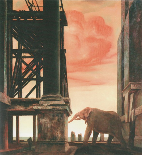
Rick Amor’s The turning season, 2000.
And as the cover for Arthur C. Clarke’s famous Childhood’s End.
+ 2 +
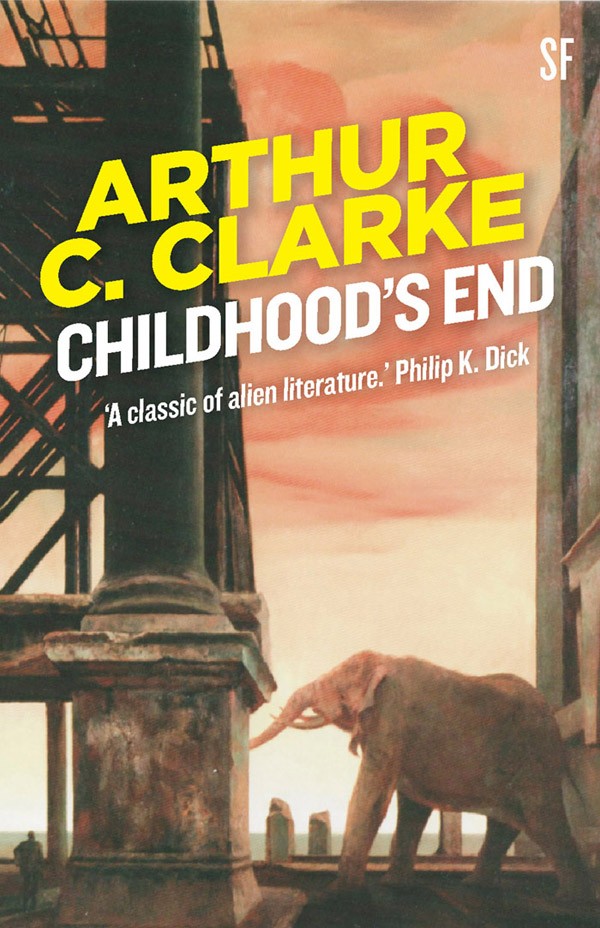
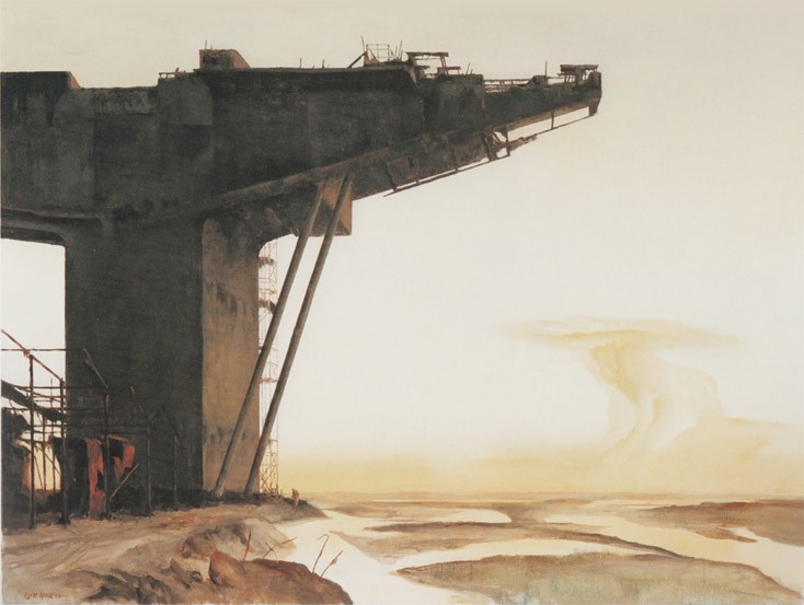
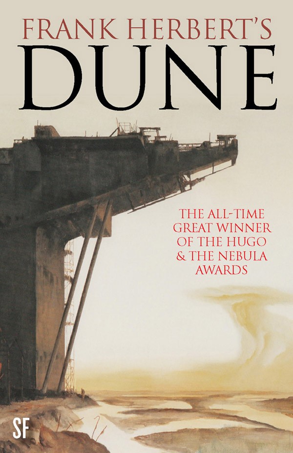
Below: Coast, 2006 (based on Amor’s drawings of the Bolte Bridge under construction). And as a cover for Frank Herbert’s masterwork, Dune.
+ 3+
Mobile call, 2012. And as Philip K. Dick’s seminal The Man in the High Castle.
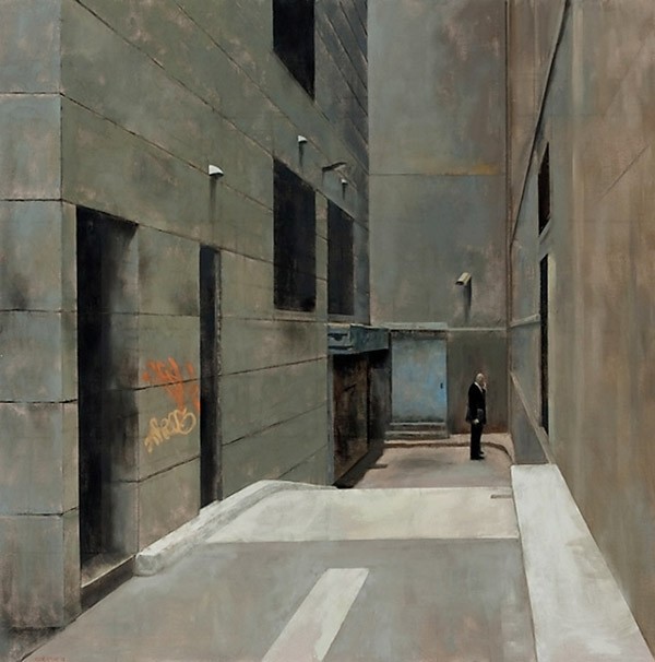
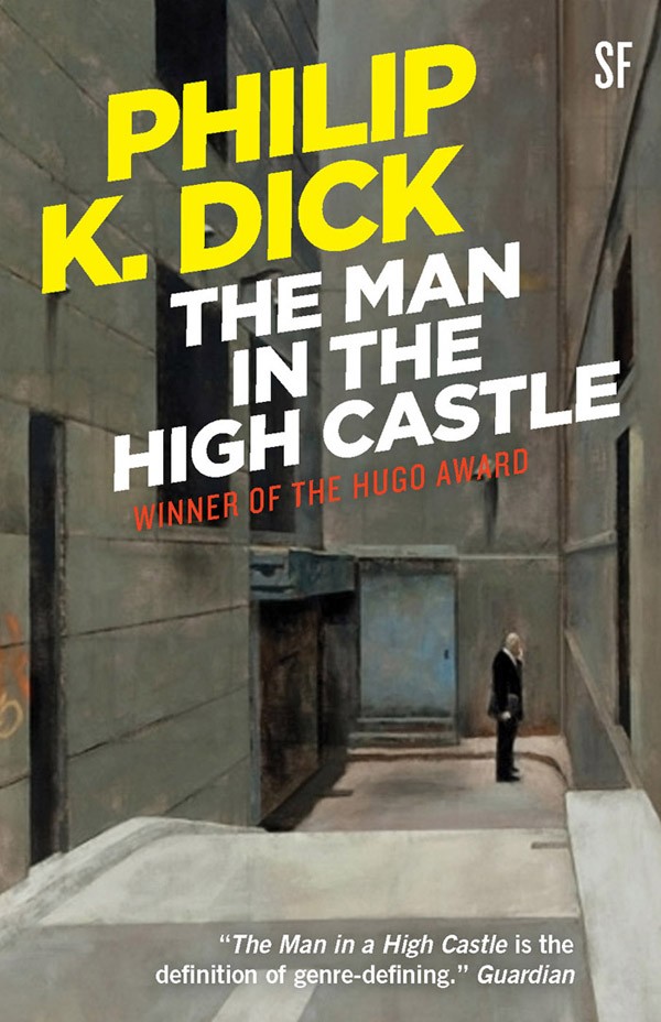
+ 4 +
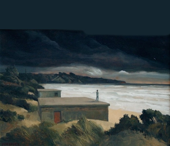
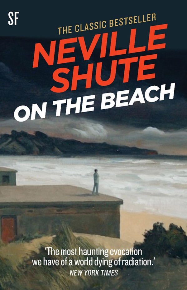
And one more, closer to home. Study for Dark day Long Island, 2012. And as the cover for Neville Shute’s end-of-the-world On the Beach.
The first two images (Clarke and Herbert) are from a tight, enjoyable survey show at Castlemaine Art Gallery earlier this year, Rick Amor: From Study to Painting which was part of their centenary program. The Dick and Shute are from his current show: Rick Amor, recent paintings: 30 years with Niagara.
After Smart, Amor: carefully composed painterly precision
The recently departed Jeffrey Smart was a crowd puller, beloved of public galleries. His style was realistic even if his subject matter generally was not; the general public* (see footnote) never have issues with the realistic-representational-figurative. It was obvious in his paintings that something else was going on; and Smart never explained — there were urban mysteries and metaphysics, with strong hints of human isolation.
Twenty-seven years younger, Rick Amor (b. 1948) shares the core of Smart’s appeal: carefully composed painterly precision. His work looks like it took work, and people really appreciate that. Unlike Smart, his colours tend to the sombre, evoking a history of tradition. Amor no longer stoops to art fashion.
Like Smart his pictures often have landscapes or urban settings with small solitary figures in them. But to me Amor’s pictures seem darker and broodier, suspended in a transitional state often made explicit in the choice of shadowed spaces or twilight. In the catalogue essay to the current show, Alex Miller quotes a remark by the late poet and critic Gary Catalano: ‘Amor’s is a painting is in which things are happening off-stage.’
‘I’ve always thought that behind the facade of buildings all sorts of mysterious things go on. I suppose it’s from my childhood and reading Kafka. I’d like to suggest that behind prosaic realities something else is lurking.’ — Rick Amor, 2005
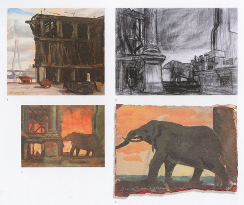
For a while “liminal” and “ambiguity” were voguish critical terms for the same reason. Amor’s very traditional pictures often depict liminality. They hover between what is, and an inkling of what might be. His transformations of urbanscapes like the Bolte Bridge construction and Blackwattle Bay into Coast and The turning season are extraordinary — how did the backdrop of Port Melbourne become a blasted plain? How did building work in Blackwattle Bay in Glebe, Sydney — there is a pylon of what must be the Anzac Bridge in the oil study — end up as ruins with an elephant (or perhaps a pachyderm)? With its small witnessing figure in the left corner.
The art of science fiction
It seems a lot to burden Amor with: the art albatross of illustration; and not only literary leanings but worse, scifi — a fanboy genre. As it happens, just the other night at a cutting edge art happening I was talking to a young person who told me her thesis was on science fiction in art. She mentioned Patricia Piccinini and Stelarc as examples. These two mixed/multi-media artists are totally scifi; they don’t merely reference it, it’s their milieu.
In contrast Amor’s is old fashioned painterly art — he draws from life, plein air, makes notes and preparatory studies, often with grid lines for scaling up; none of it is outsourced or assisted, it’s all autograph. (Above: from the Castlemaine show catalogue.)
His stylistically conservative paintings work for my imagined book covers of future times not because they are literal gestures to scifi, like Piccinini’s and Stelarc’s. It is because his paintings insert strangeness into recognisable — or visually comprehensible — scenes. The strangeness has a what-if quality. What if Blackwattle Bay looks like this sometime in the future? What if the figure on the flat roof looking out to sea is the last person on earth?
Amor’s pictures as often as not do not feel hopeful to me. He has an instinct for decay; and a colour mood that fits the pre-apocalyptic. But what they do a lot of the time — these seemingly meticulous observations from the world around us — is to suggest “something else” is going on. Something dark, or something big; the time before or after a pivot. (That’s often what Raymond Carver’s stories do.)
And that’s why they work as science fiction covers. Amor’s pictures look quiet so their subject matter can be even more subversive — they promise change.
Rick Amor, recent pictures:
30 years with Niagara
30 July – 7 September 2013
+ + +
Footnote
*In Australia’s (or any Western industrialised country) leading commercial contemporary art galleries — that is, those most noticed or bought from by public art institutions, eg Anna Schwartz, Tolarno, Roslyn Oxley9 — you will not likely find many significant traditional figurative or realistic painters, apart from oddities like Peter Booth at Schwartz, or Louise Hearman at Tolarno.
The gifted young (under-40) painters with skills in realistic painting — say, in Melbourne, like Sam Leach or Juan Ford or Amanda Marburg — have no truck with conventional representations of life as we know it. Their trucks are consciously powered by theory and their rendered scenes come with air quotes — bluntly I think that a lot of these moves have to do with being seen to be with the program.
But that non-specialist Australian audiences still enjoy representational-realistic art is indisputable, proven by the popularity of the Annual Archibald Cup — which the youngish painters mentioned above have starred in; and the type of exhibitions the state galleries throw on as their blockbusters, like the NGV’s Monet show.
In the grand trad art shop, Australian Galleries, we all know the big names: Nolan, Boyd, Olley, Jeffrey Smart, Brett Whiteley, William Robinson, Garry Shead, Tom Storrier. Their mode is figurative-representational-realistic, spiced with individual idiosyncracies.
All this is simply to say that, no matter what groove or fashion contemporary art may be in at any given moment, people like art that more or less looks like the world.


Crikey is committed to hosting lively discussions. Help us keep the conversation useful, interesting and welcoming. We aim to publish comments quickly in the interest of promoting robust conversation, but we’re a small team and we deploy filters to protect against legal risk. Occasionally your comment may be held up while we review, but we’re working as fast as we can to keep the conversation rolling.
The Crikey comment section is members-only content. Please subscribe to leave a comment.
The Crikey comment section is members-only content. Please login to leave a comment.