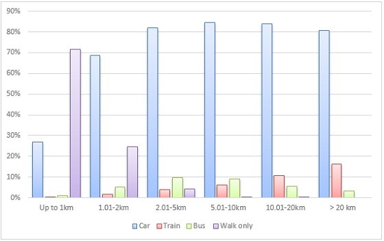
Percent trips by distance category and mode on an average weekday in 2012-13, Sydney Statistical Division (source: BTS)
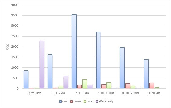
The first graph shows the proportion of trips taken by the main transport modes in Sydney for different distance bands (kilometres). It’s based on data from the NSW Bureau of Transport Statistics’ (BTS) household travel survey 2012-13. The second graph presents the absolute number of trips.
Number of trips (‘000) by distance category and mode on an average weekday in 2012-13, Sydney Statistical Division (source: BTS)
It can be seen that:
- Walking is the preferred mode for distances up to one kilometre. It’s used for 71% of these short trips. It’s also very important for distances between one and two kilometres, accounting for 24% of those trips;
- Driving is by far the favoured mode for all distances above one kilometre. It’s the mode of choice for at least 80% of all trips longer than two kilometres;
- Train and bus are very much minority modes. Overall, they comprise 6% and 5% respectively of all trips, compared to 69% for driving and 18% for walking; and
- Train does significantly better for longer trips than shorter ones. It’s share of trips longer than 20 kilometres is 16%, compared to 4% for trips of two to five kilometres. Indeed, it’s the only mode where the absolute number of travellers increases consistently with trip length.
The graphs complement the data on the duration of trips in Sydney I discussed recently in “Is driving quicker than taking the train?”
The two measures — kilometres and minutes — show the same overall pattern: there are big differences between modes. The sorts of trips made by train are much longer, both in terms of distance and duration, than those made by car.
Of course the exhibits describe the existing travel behaviour of Sydneysiders. The pattern is the result of a number of factors, especially historical land use and transport infrastructure development decisions.
It also reflects policies like the absence of a price on use of road space, limited co-ordination of modes, and restrictions on residential development. For better or worse, this pattern is the starting point for policymakers.
The exhibits indicate the big challenge for public transport is to capture mode share from cars. To do that it will have to be much more competitive for short trips; more than half (58%) of all trips in Sydney are shorter than five kilometres, and 76% are less than 10 kilometres. Only 10% are longer than 20 kilometres, where trains currently do best.
Public transport patronage will increase if improvements like higher frequencies, better co-ordination within and between modes, strategic investments in infrastructure, and a multi-modal fare structure are implemented.
But generating a significant increase in public transport mode share — something that seriously changes the relative heights of the bars in the first exhibit — will be far more challenging.
The other big challenge for policymakers is to do something about cars. They’re by far the dominant mode in the metropolitan area and, notwithstanding increasing congestion, their share of trips is falling slowly (by 0.17% p.a., averaged over the last 10 years).
Public transport will not record a really serious increase in mode share at the metropolitan level unless system improvements are accompanied by measures that make cars relatively less competitive.
As I noted in the earlier discussion of trip duration in Sydney, policymakers need to think seriously about how to ration demand for road space in congested locations (e.g. by congestion pricing); how to make cars cleaner, quieter and more fuel-efficient; how to make them safer for other street users; and how to make them more respectful of urban amenity.




Crikey is committed to hosting lively discussions. Help us keep the conversation useful, interesting and welcoming. We aim to publish comments quickly in the interest of promoting robust conversation, but we’re a small team and we deploy filters to protect against legal risk. Occasionally your comment may be held up while we review, but we’re working as fast as we can to keep the conversation rolling.
The Crikey comment section is members-only content. Please subscribe to leave a comment.
The Crikey comment section is members-only content. Please login to leave a comment.