The Urban Living Index of Sydney suburbs released last week was developed by the Urban Taskforce Australia in partnership with McCrindle Research.
Like the list done by The Age I discussed recently, this is yet another league table, so it’s based on some implicit notional idea of the average Sydneysider, below:
The top gong is a tie between Surry Hills and Crows Nest-Waverton. The silver and bronze go to Pyrmont-Ultimo and Marrickville.
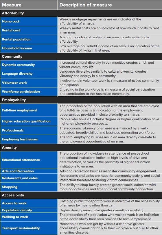
The Urban Living Index is built on 20 measures that purport to define five broad indicators of liveability: affordability, community, amenity, accessibility and employability (whatever that is).
It starts with the lack of transparency that seems customary with these exercises. There’s little information on how the authors executed the task. So, for instance, the authors use “arts and recreation” as a measure of suburban amenity but don’t tell us what it actually measures.
Further, all 20 measures have equal weight. So something as vital for residential location as accessibility to work counts as much as the proportion of rental properties in an area, or the proportion of residents in full-time work.
What’s especially strange is the measure of access to work is restricted to public transport and walking, with no mention of commuting by car. That’s bizarre given 70% of Sydneysiders journey to work by car, 21% by public transport and 6% by walking.
Then there’s a measure of the proportion of tertiary-educated residents in each suburb and another of the proportion of professionals. Weirdly, they’re grouped under the “employability” indicator, but they sound more like a measure of whether or not a suburb has fellow residents “who’re just like us”.
Perhaps some well-educated professionals do see the liveability of suburbs in those terms, but I doubt the majority of the population — who aren’t professionals and don’t have degrees — give them much weight.
I suspect they’re far more concerned about affordability, accessibility and the amount of private and public space available; which is a problem because there’s no measure of dwelling or lot size. Nor is access to open space measured, nor landscape amenities like tree cover.
The whole exercise strikes me as inner-city centric. If you’re one of the minority who works in the CBD and lives in the inner city, this index might well be useful.
But if you’re one of the great majority who lives and works in the suburbs and is reliant on driving for most trips, this Urban Living Index won’t be very helpful.
These sorts of league tables are problematic because they necessarily assume an average resident; the problem is location choice differs according to key factors like life-cycle stage.
This one makes matters worse by though by implicitly defining liveability in terms of a what matters most to a relatively narrow slice of residents.


Crikey is committed to hosting lively discussions. Help us keep the conversation useful, interesting and welcoming. We aim to publish comments quickly in the interest of promoting robust conversation, but we’re a small team and we deploy filters to protect against legal risk. Occasionally your comment may be held up while we review, but we’re working as fast as we can to keep the conversation rolling.
The Crikey comment section is members-only content. Please subscribe to leave a comment.
The Crikey comment section is members-only content. Please login to leave a comment.