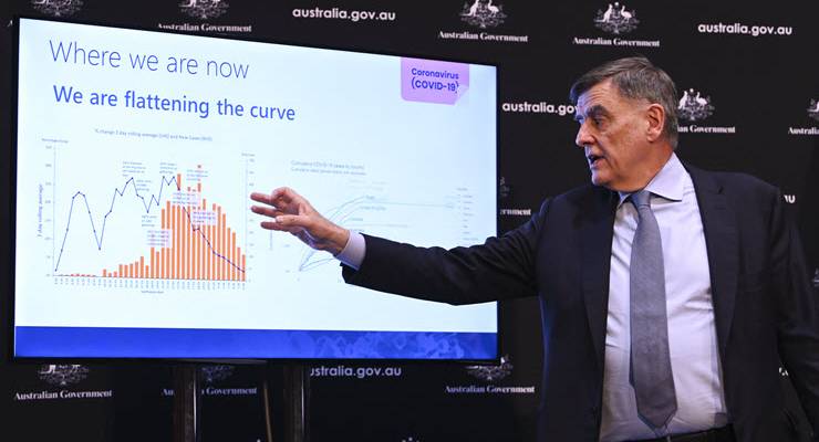
Yesterday, the government finally did what many scientists, journalists and commentators had been pressuring them to do for weeks, and release some of the modelling that had underpinned their response to the COVID-19 pandemic.
The modelling, by Melbourne’s Doherty Institute, paints a stark picture of what Australia’s worst-case scenario could look like. But at the same time, experts and policymakers have repeatedly stressed that it does not offer a concrete prediction about what our fight against the pandemic might look like.
What does it tell us?
The modelling released yesterday didn’t tell us many of the things we’re desperate to know. It didn’t tell us when the lockdown would end, or whether we should close schools. Nor does it make us any the wiser about which of our beloved activities are essential or not — the modelling won’t help you avoid a fine. As both Scott Morrison and chief medical officer Brendan Murphy stressed during yesterday’s press conference, the modelling is theoretical, not predictive.
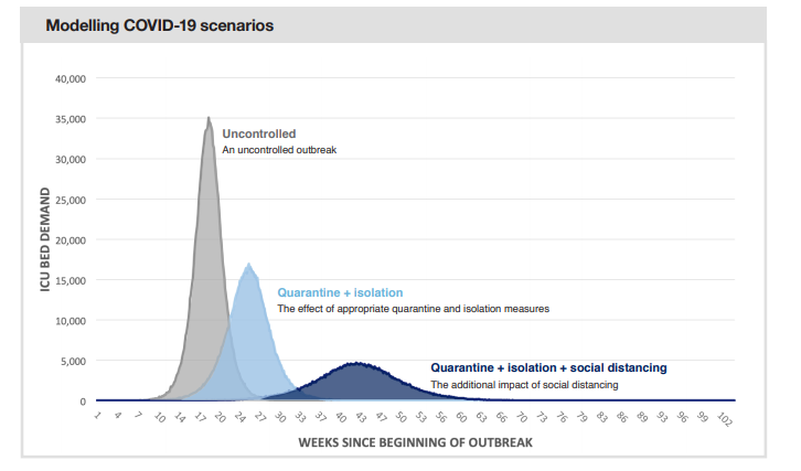
What the modelling does tell us is just how bad things could’ve gotten if we hadn’t taken strong action. Based on international case data, the team modelled four different scenarios, from one where the government had not intervened, to a scenario with quarantine, isolation and social distancing.
If we’d allowed for unmitigated spread of the virus, 90% of the country would have been infected, 35,000 intensive care beds would be needed per day. Our health system would be stretched to breaking point, and only 15% of the people who needed an ICU bed would get one, leaving doctors to make some truly painful decisions over who gets to survive, as they have had to do in Europe and the United States.
On the other hand, with quarantine, isolation and social distancing, we’d reduce transmission 33%, meaning everyone who needed an ICU bed would get one.
Why are there discrepancies?
What is harder to determine from the data is where exactly we are now. Some early expert reaction suggested that Australia is in a “relatively lucky position”, especially with the number of new cases falling each day for the past week, and with unconfirmed local transmission relatively in check.
But the nature of epidemics is what makes predictions nearly impossible.
“We can model airplanes flying because the laws of physics are predictable,” Monash University epidemiologist Allen Cheng wrote on Twitter.
“Human behaviour is not predictable. There is little data on how people are behaving at this unusual time and how that impacts on viral transmission.”
Complicating things further is the fact that other modelling has given us potential end dates, something the government’s modelling notably does not. One model suggested we could still be cooped up over Christmas. Another said our hibernation could be over by the end of winter.
Mikhail Prokopenko, a professor at the University of Sydney, developed different epidemic models, incorporating Australian data, which indicated we could reach our own pandemic peak in the next month.
“Unlike our study, the government’s model is coarse-grained, and does not include detailed predictions of what will actually occur in Australia,” Prokopenko said.
Ben Phillips, an associate professor in ecology and evolutionary biology at the University of Melbourne, says the government used international data because so much of what we know about the virus and its behaviour has come from observing what’s happening overseas. We simply don’t have enough local information.
And regardless of where the data comes from, experts say the government’s modelling is good and trustworthy.
Annette Dobson, a professor of biostatistics at the University of Queensland told Crikey the modelling released yesterday was far and away the best available, and warned that some other models that have been circulating online and in the media over recent weeks were “relatively incompetent.”
“This is the one that people should be taking notice of. Ignore all the others,” Dobson said.
Should the government have released the modelling?
It took the government weeks to reach the point of making the modelling available. Initially, Morrison was reluctant to do so. Deputy chief medical officer Paul Kelly said he would last week, before saying he wouldn’t.
One of the reservations was how the public might react — the government and their advisors seemed wary of armchair experts misinterpreting the figures and making populist pleas to change the course of our current response.
Phillips said that while that was a valid concern, he welcomed the government’s more open and transparent new approach.
“There’s certainly an issue that needs to be balanced, but in the absence of good information, there’s a greater risk that people will freak out and jump to the wrong conclusion,” Phillips said.
According to Dobson the released modelling, done by some of the country’s best experts, and carefully communicated to reduce the risk of misinterpretation, “should be such a boost in confidence.”
Dobson acknowledged that people might be disappointed with what the modelling didn’t provide — a clear end date, and a neat resolution to the present state of upheaval. But such uncertainty is likely to become the new normal.
Like a weather forecast, the modelling just tells us what might happen, not what will happen.
“In science, you really hardly ever get certainty,” Dobson says.



So, in result its the release of some of the modelling and is wrapped up in ‘careful communication’. If I’ve got that correct, then, in plain language this means its been censored and it only comes with government propaganda. FFS why are they so effing patronising?
I just also hope they didn’t base their decisions on just one model from just one model shop, and they were peer reviewed by people without a conflict of interest. In hindsight, they might be correct, but what a way to make such big decisions!
Never seen bubble dancers before?
Like experts worldwide, the Chief Medical Officer has obstructed his message to the public by failing to convert his jargon into clear English. Journalists could make the effort to translate it into plain English for us, but often pass the obscurity on to baffle the reader.
In the image his right hand is pointing to a histogram that we should read as “new cases per day”, but I suspect you’ll find that the words “new” or “per day” are missing. That obscures the fact that the number of cases in the queue for ICUs will relentlessly increase until the rate of new patients decreases to match the rate of discharge. The fearful should not be encouraged to hide from that fact. The number of active cases is graphed on the same screen, but is hidden under his arm. Again, I suspect the word “active” is missing from that graph too.
Further in the article, three of the four model scenarios are shown as bell curves. The label on the Y-axis is misleading, should in fact read “daily increase in demand for ICU beds” or better, “daily increase in critically sick patients”. On the worst case curve, that means that on one day there might be increase of 35,000 dying for lack of ICU beds, followed by a decrease on the following day, where only a further 34,000 extra patients join the queue for non-existent beds. That is not a decrease in cases or need for beds, it is a levelling out of the number of active cases. In fact ICU beds cannot be built at that rate, nor staff be trained and anti-viraled in time to man them. But it does imply a scenario where three million or so Australians are sick or asymptomatic and infectious at the same time. He could have just said so. And our journo could well have elucidated for us.
Good models need good data.
So why don’t we have better data? We have the luxury of not being inundated with corpses and have a sophisticated health system and well educated workforce … so have we got anything to match
Hong Kong’s real time dashboard(s)?
https://covid19.sph.hku.hk/dashboard
https://chp-dashboard.geodata.gov.hk/covid-19/en.html
I’d be fascinated to know why this island continent, blessed by our beloved St Girt de Maris – Ruby Princess & diploma mills offering $7,000 discounts to 42,000 Chinese students to pleeeeez come asap notwithstanding – is, allegedly/supposedly (how stoopid is this government… on a scale of 1-10,000?) relying on something “Based on international case data”.
Why not just state the plain facts?
1) “flattening the curve means everyone is gonna get it, just over an artificially, repressively extended period
2) the ABC service announcements state “corona is a mild disease and most people recover quickly…” so why the panic?
3) when the “most people” referred to in #2 above are again up & about will they be dragooned into digging mass graves or put in uniform?
This is just for starters.