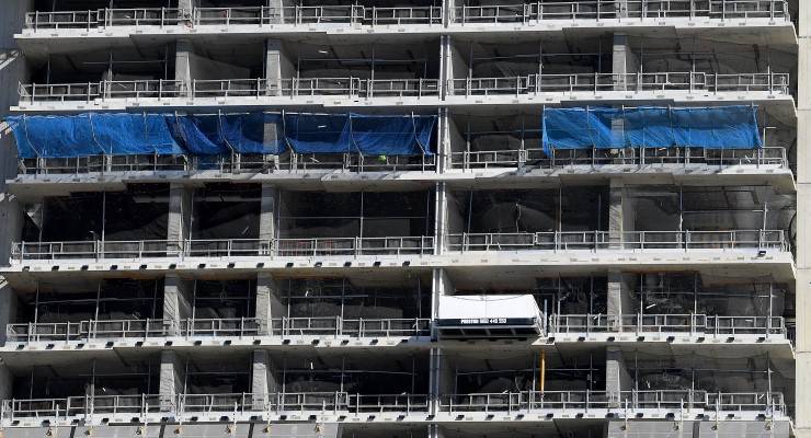
Hundreds of partly built homes across Australia remain unfinished after established construction company Privium Group went into liquidation last week. The homebuilder reportedly lost more than $28 million last year. Total losses are currently unknown.
Privium is the latest in a string of collapses since the construction sector began its severe decline in 2015. These include CMF Projects, Rimfire Constructions, Queensland One Homes, Leaf Building, Planbuild and many others.
This is happening when tens of thousands of Australians are desperate to buy houses, social housing builds are at an all-time low, migration is about to resume and the federal government has been subsidising first home buyers and spruiking a resurgent economy.
Data from the Australian Bureau of Statistics (ABS) reveals that the centuries-long upwards slope of construction volumes in Australia dramatically reversed in 2015. Year-on-year falls in spending on total construction have been infrequent since the ABS began publishing data in 1974. Almost certainly they have been quite rare since colonial construction began in 1788.
There was a decline in 1991 and 1992 during the global recession of the early 1990s, and again in 2001 when the early 2000s recession hit the developed world. But growth has been steady at all other times — until 2015, as the chart below demonstrates:

The data in this chart includes both housing and engineering construction in the private and public sectors. It shows chain volume measures which have eliminated the effects of price and hence only reflect volumes.
Total spending fell in 2015 to $235.9 billion, down 7.3% from the peak of $254.5 billion in 2013. Spending declined in 2016 and again in 2017 when it was recorded at just $217.2 billion. That was 14.7% below the peak. The recovery in 2018 was short-lived as this has been followed by falls every year since. The spending in the financial year ended last June was just $211.1 billion, which was 17.1% below 2012-13.
Public versus private
Most of the recent decline in construction has been in the private sector. Public sector spending in 2015 was $38.9 billion, down 19.9% from the 2013 level of $48.5 billion. Spending in 2017 was $45.2 billion, down 6.8% from 2013. But by 2021, spending had risen to $51.9 billion, a rise of 7.1% over 2013. That is still a decline relative to population, but it is at least slightly ahead.
In contrast, private construction spending in 2015 was $197.3 billion, down 4.2% from the 2013 level of $206.0 billion. The 2017 spend was $171.9 billion, down 16.5% from 2013. Spending in 2021 was $159.2 billion, down a thumping 22.7% from the 2013 level.
Causes of the collapse
With the bust beginning in 2015 and accelerating in 2017, this is clearly not caused by the pandemic. In fact, the billions in funds allocated by the Morrison government in first homeowner grants should have seen a similar surge in 2020 and 2021 to that in 2009 and 2010, which was during a much more severe and sustained global recession.
One analysis of Privium Group’s bankruptcy claims it is due to rising costs and labour shortages. This is not supported by the evidence. Inflation between June 2014 and June 2021 was extremely benign at below 2.3%. Unemployed Australians currently number 707,300, with another 1,157,000 recorded in August working zero hours. Wages since 2014 have grown at the lowest rate since records have been kept.


So…we don’t know then what is causing this?
The build money went on rent, that’s what.
And when everyone gives up, hope gone, look out.
Well, if you reduce disposable household income, not leaving enough to support saving for a home deposit and underpaying to the extent that people can’t afford a consequential mortgage then the banks won’t lend under prudential regulation requirements.
If people who cannot afford to buy also cannot afford to rent, the only option is share accommodation which, by the way, includes moving in with friends, parents and the like.
Trying hard to save for a deposit has a flow-on effect on the broader economy because it reduces what is known as disposable income which disadvantages hotels, nightclubs, tour operators, tourism industry, footwear manufacturers, makeup counters, the list is near endless.
Insufficient disposable income means a slowing economy, a stagnant population by historical standards, unhappy voters, and governments that are clearly not up to the task.
Wages have not only to keep up with inflation, but also stay ahead of the Consumer Price Index or we are actively moving backwards as an economy.
Economic managers the liberals are not.
So, in a nutshell, people can’t afford to buy because income has stagnated for the past eight years.
Also includes our burgeoning retiree cohort who potentially or actually have much disposable income but is not hitting the ‘real economy’ or non essential spending.
They may be frugal, conserving for children or grandchildren or simply have no need to buy anything, as they have enough stuff and are downsizing; only spending on essentials such as food/drink, running a car/house, medical and modest travel or entertainment.
I understand that some builders are having cash flow problems caused at least partly by the supply problems with materials. Which I think comes back to China as usual.
Interesting, according to some such a dip in real estate fortunes is easily explained versus the PR produced by most FIRE obsessed media, lacking financial literacy. What is missed by much economic or financial analysis of property in Australia is the sub-optimal data for both real estate and population demographics.
If using a prism of Statistics 101 and some academic integrity, our real estate market has more to do with PR than grounded analysis. This is due using indirect indicators e.g. (manipulated) clearance rates, drawing upon data via RE websites, ignoring private treaties, and unclear presentation i.e. nominal prices vs real value (reflecting all costs over time), while an artificial market divide exists between (surplus impacted by closed borders/low or no NOM) apartments and houses/units.
On population, we are compelled by FIRE on ‘FOMO’ and ‘wedge’ driven media to focus upon headline NOM net overseas migration or temporary churn over (impacted by international students, 2nd year backpackers etc.) and estimated raw population (using inflationary UNPD formula).
However, this ignores the more credible OECD data for long term trends, workforce ages etc. that show Australia being no different from elsewhere e.g. Germany; we have an ageing and declining permanent workforce with increasing dependency ratios i.e. more retirees, fewer children and few taxpayers in the permanent population (excluding temporary residents/churn over).
Analysis of population and (a flat) economy has been related to our ageing permanent population, with increasing numbers in retirement past peak earnings, but have no need to spend much, hence, the economy is less dynamic; this may change in future once inheritances flush through and demographics balance out electoral rolls after the baby boomer ‘bubble’ passes.
Thanks, Drew. You make some interesting pints.
But how do you explain the inexorable rise – with very rare plateaus or dips – from 1788 to 2014, then the steep decline from 2015 onwards?
What happened in 2014/15 to change the trajectory so dramatically?
Unclear as to which factor you are referring to?
If referring to interest rates, they hit a peak 2010 – 12 but then continued their downward trajectory.
If, house prices then above, and all manner of incentives, plus religious worship.
If, permanent population, there would have been peak (say born ’55) baby boomer in 2015, had them at 60 transitioning to retirement….if not already.
Thanks, Drew. The reference was to the graph in the article showing all construction work in Australia as recorded by the ABS.
Your observations don’t seem to explain the sudden decline.
Correction: you made interesting points. (Of course, if you are a home brewer, I’m sure you make interesting pints also.)
Stout and beer together from 2 X 500ml cans, preceded by a cpl of Rose gespritzers 🙂
Put simply, it’s the issue of headline data not explaining much; probably needs parsing through various factors or construction types, with industry comment too (= good social science mixing qualitative data for analysis needed to choose factors, then the quantitative round same factors, and final analysis).
My issue in Oz media and politics is the paucity of firstly science/data literate journalists, then good data analysis that tells a story and informs people versus the preference for creating headlines and slogans e.g. not just property but analysis/dog whistling of headline population, migration or the ‘nebulous’ NOM; masking very complex dynamics over time.
Now TDN has a weekend ‘stats guy’ looking at different types of data, and the newish ByLine Times indie investigative journalism outlet in the UK, has a qualified ‘science journalist’; meanwhile legacy or mainstream media have disappeared science and good data analysis.
Now I understand, re. the chart, without accessing separate factors. Maybe a rise, especially in noughties, of CBD etc. apartment construction catering to downsizers, renters and international students?
I would suggest that post 2015 it’s been a marginal decline of about 10% that may reflect a slowing economy?
Thanks, Drew.
It is also noteworthy that construction was not the only economic outcome to reverse trajectory dramatically in 2014/15. Others to switch direction include:
* retail sales,
* manufacturing,
* social housing builds,
* infrastructure investment,
* Australia’s global ranking on economic growth,
* productivity,
* full-time jobs,
* underemployment,
* unemployed youth,
* the long term jobless,
* elderly citizens forced back to work,
* wages growth,
* value of the Aussie dollar,
* company taxes as a ratio of reported profits,
* budget deficits,
* federal government debt,
* imports as a percentage of exports,
* the nation’s net worth.
All these deteriorated in 2014 or subsequent years. All have been analysed here at Crikey.
Good one, and related a stats blog from several years ago regarding the tepid economy and the NOM net overseas migration*
‘As far as graphs go, Net Overseas Migration, (NOM) would have to be one of the rising-stars in Australian economic policy debates. The significance of NOM to housing (hence banking, hence sharemarket) is pretty obvious. It also makes a crucial contribution to ‘Estimated Resident Population’, perhaps one of the most important statistics that’s relied on for imputing, scaling and basing a host of other crucial statistics.
But this particular graph’s influence has also ridden the tide of confusion swamping the world’s economists, who are floundering to explain the new low-inflation, low-growth new-normal paradigm that has beset the Western World.’ (writer goes on to explain how the expansion and inflation of the NOM in 2006, significantly impacting other data, but noticed nor understood by anybody).
https://www.quixoticquant.com/post/the-missing-million/
PS: One would add that the NOM used by the ABS is the UNPD version, only used by UK and NZ, vs. most nations e.g. EU Schengen Zone, don’t have the borders to measure churn over and/or based upon residency permits issued in country.
Accordingly, for comparison, it’s why the OECD data elaborates more by parsing out temporary residents for working age cohort and other demographic analysis i.e. focus upon long term permanent population trends (not short term noise); using this OECD formula means Australia is like elsewhere (without padding from temp churn over), we have passed peak working age and on the way to approaching peak retirees?
Yes, Drew, tracking working age and retirement has been intriguing in recent years, as this also changed trajectory noticeably in 2014/15, as shown in the yellow and blue graph here:
https://uat.crikey.com.au/2021/01/27/australia-jobs-data/
Since that article was published the percentage of seniors forced back to work peaked at a new high of 15.3% in February this year, but settled back to 14.6% in September.
Regarding the NOM, are you suggesting this explains the change in trajectory of construction in 2014/15, Drew? It is not clear how so.
No.
However, the NOM ‘muddies the waters’, misinterpreted i.e. too much importance is applied to border’s temporary churn over (acting as a Trumpian but virtual border wall by media), dominated by international students with work restrictions etc., too many use headline figure but ignore the complexity behind it, used to pad out presentation of future population pyramid (then to avoid super SCG increase to 12% and claims of pensions are sufficient), misleading description which ‘Australia’s best demographer’ labelled the NOM simply as ‘immigration’ (dog whistle), suggesting the NOM is permanent migration (capped anyway).
Very confusing and those counted in (after locals parsed out) are directly blamed for ‘population growth’ and all the other perceived negatives (and also used to spruik property and FOMO); this leads back to the ’70s US ZPG who helped form similar in Australia……
Without seeing any detailed data on construction, one could only suggest that 2014-15 was the start of a lower trajectory in many sectors, and this may reflect that our permanent population has passed peak working age, spending and investment; not clear how it will improve?
Could it possibly have anything to do with having a Lib/Nat coalition government run primarily by the right wing zealots whose main fascination is with cronyism, wealth and power ? Equity and social cohesion are left by the wayside.
Thanks, Camille. But the question remains: what happened in 2014 to change the graph so emphatically?
Did blokes become less inclined to do hard physical work and work long hours in 2014? Doubtful.
Did real wages start to decline, workplace deaths escalate, household incomes decline and the economy overall lose its world’s-best status? The evidence suggests so.
One argument goes like this, Camille:
Lower wages directly reduce retail turnover which flows on to wholesalers, importers, manufacturers, primary producers, transport and service providers. Then beyond.
The more money in the hands of high income earners means more money shunted offshore into foreign tax havens.
The more in the pay packets of low-income workers means stronger retail sector with flow-ons through the entire domestic economy. A strong domestic economy means more jobs.