
In a storyline that would feel appropriate in a political satire written by Armando Iannucci, the Prime Minister and Cabinet’s (PM&C) Women’s Network logo has been taken down from the department’s website after numerous Twitter users pointed out that it looked like a dick and balls.
Here it is, just in case you thought this was another Twitter blow-up:
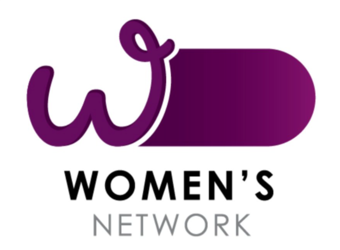
Twitter users were quick to point out that not only was this logo incredibly degrading to women but that there is also no way that the design was accidental.
Not everyone thought the logo looked like a male appendage; many thought the “W” looked like breasts. Great. Others pointed out that the purple used is the exact colour as the eggplant emoji, a symbol that has been recognised in the digital world as a penis for the past decade or so.
A statement issued late yesterday by the PM&C says staff rebranded all the “staff diversity networks”, including the Women’s Network logo, in 2019 “to establish a consistent look and feel”.
“What?!” you’re thinking. “The PM&C’s website is full of logos that look like the inside cover of a 15-year-old boy’s maths textbook?!”
Not quite. The other diversity networks within the Department of PM&C all have logos using bars of different colours.
The statement continued: “The rebrand was completed internally, using existing resources, and designs were consulted on widely … The logo has been removed from the department’s website, pending consultation with staff.”
Surely — surely — the same staff who commissioned this, approved this, put it up on the website are not the right people to now be consulted on just how offensive it is for a network that supposedly ”promotes gender equality and supports members to succeed in their personal professional lives” to be headed by a giant purple penis?
The whole saga is reminiscent of the now-infamous “milkshake consent” ads, where a government department released learning resources for school-aged children comparing sex to tacos and milkshakes before removing some of the videos after backlash pointing out how problematic some of the themes in the videos were.
It’s easy to label the phallic logo as just another cock-up by a PM who seems partial to them, but in the current political climate this particular incident feels incredibly juvenile and just plain gross.




Why is it necessary to have a logo?
It took remarkable skills to get this so wrong.
True, it can’t be just ineptitude – almost as if it a dig at the cis.
Some coked up man-bunned know-nuttin in a branding consultancy, presumably a maate’s.
I can’t believe this is anything except deliberate. Totally taking the piss.
It’s a fitting sign of the LNP attitude towards women.
Not the point of the yarn, I know, but a basic understanding of government should make clear the distinction between the Department (comprising apolitical public servants) and the PM’s Office (comprising political appointees). Clearly the Women’s Network logo was a product of the Department (notionally not a political entity), so suggestions that this is “Morrison’s office” (headline of this piece) or personally chosen by the PM (wags on Twitter) are mistaken.
Yeah – gotta be fair. There’s enough stuff that IS his fault!
I don’t think that the notion of public service Departments being apolitical has been reality since it became common-place for incoming governments to sack all of the existing upper-level department staff and replace them with political appointees.
I’ve been assuming for years that that’s why the system hasn’t been working (at least not in the public’s interest).
“I know, we in the apolitical department will try and curry favour with the prime minister by hiding a giant c ock in a logo.”
Yep, sounds incredibly plausible.
Nice take on it though to gee up the ladies and keep the anger boiling.
It would seem that Smirky’s creative staff despise him as much as most of us do.