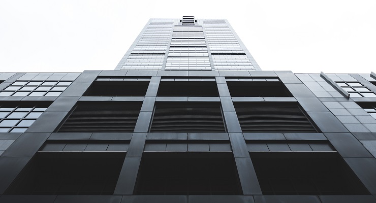
In Richmond, Melbourne, a grey pall hangs over the streets — and remains, even when the clouds clear. It’s the new buildings going up, as they have been for a couple of years now. Since the area height limits were revised, the gold rush has been on, to go as high as possible, with cubes of carved-up space. Victorian heritage hasn’t been that affected, as it might once have been. Buildings don’t actually get saved, but we get to keep the front couple of metres of them.
But anything after Victorian is still game, with a row of three Edwardian shops going a few months ago. Tiled insets, bevelled glass, pressed tin ceilings swept away — as they are being swept away all over Melbourne — for a concrete pile. They could all be built behind, and the developers get their floors, if the planning laws were so adjusted. But they won’t be, and Melbourne’s distinctive look will be eaten away, year upon year.
What’s going up — instead of buildings of variety, colour and detail — is the grey. Vast walls and cliffs of it, every direction you look. The architecture that was once scorned as distinctive of the economically failing Eastern bloc — depressive, featureless, jerrybuilt — is now our urban vernacular. How did it come to this?
So-called “tilt-up” construction has been around for more than a century, but it didn’t spread much beyond warehouses and “zero-degree” architecture for decades. In the US it started to come in from the outskirts to the city proper in the 1970s. Its expansion was delayed in Australia, in part because the powerful Builders Labourers Federation (BLF) managed to keep the technology out for a while, as it cuts down jobs significantly. Once it got going, it spread widely.
Such a spread, here and everywhere, is a product of steadily lowering minimum standards of urban finish. Which is to say, once upon a time, it was simply understood that a building people would see often, in the city, required a degree of design and finish. Though that has reduced over time, from high ornament to sleek modernism, there was until recent decades a bottom limit.
Culturally, that collapsed in recent decades as the nihilist logic of expanding capitalism wore away at the culture. Tilt-up construction, with its mathematical, minimal slicing up of space, is how the world looks to capitalism: commodified cubes of the world. Once it becomes culturally acceptable to use it everywhere, it begins to crowd out other forms of construction. Its flat, simple shapes leave no possibility of variation of form or texture. Ornament is simply elements hanging on a box. But there is usually no ornament at all. The panels could be any colour, or multi-colours, and in some countries they are. Here, developers are permitted to serve it up raw and cold, looming over us.
Almost everyone, as far as I can tell, finds these buildings dismaying, their featurelessness a sort of turning away of the city from its actual inhabitants — an indifference. How did it even become possible that such a non-style became culturally acceptable?
The answer lies in the strange trajectory of architectural modernism, which was introduced into social life in the early 20th century, precisely as a refusal of what people in every culture have always sought from buildings: detail, ornament, pleasure, delight. From Adolf Loos’ Ornament and Crime of 1904 — ornament, by registering inequality, creates decadence; featurelessness enforces equality — to the Bauhaus, modernism was associated with an austere imposition of an ideal program by intellectuals on popular life. Whole cities were to be demolished; in Melbourne, parts of them were, with the demented levelling of whole neighbourhoods for the Housing Commission’s homemade “machines for living”.
Having taken over public building, the movement was taken up by capitalism, which was overjoyed that there was now a positive aesthetic that emphasised mass production, regularity, and lack of variant detail. Minimal skyscrapers went up, the old detailed buildings came down. Modernism failed in all art forms — concrete poetry, atonal music, black field paintings — but it failed in architecture first, because by the 1970s it had become simply intolerable to live in or look at. What returned was postmodernism: highly coloured, quirky, detailed form, full of hidden references. This had its own problems, to say the least, but it gave you something to look at.
But what persisted long after modernism was the anti-natural, social constructionist notion that there was nothing intrinsic to human beings that might give us a clue as to what might be good or bad in life. Governments, planners, authorities — all lost the courage to say that something looks categorically terrible, or is just a negation of life, because the notion that everything is subjective became generalised. And it’s true that any form, of itself, can be striking and interesting. But it’s a question of the particular and the general. One soaring slab of grey among a sea of detail can be striking and meaningful. Fifty of them? Depressing and degrading. We like ornament and detail because, quite aside from the variation in seeing it multiple times, even visually, it satisfies the need to register touch, and sensuous particularity.
By generalising the notion of subjective taste, the modernists could get to do whatever they wanted. That value-free notion is now implanted not merely into planning laws, but into planning ideology. Planners will say this stuff is terrible, but when you suggest that one response might be positive planning standards, they then say the magic word: “subjective”.
Subjectivity occurs with a range; some human values are far more general. There’s a reason many cultures use “grey” as a sign of the dislikable; it suggests dead flesh. It is a deep-seated anti-preference, which coincides with the cheapest possible way of building.
There are all sort of problems with any notion of positive standards. But cheap developers are relying on the fear of those problems to throw up buildings that will blight the landscape for decades to come. Is there much likelihood of it being introduced at a statewide level? Haha, not a chance. The Andrews government is desperate to get building happening to pull the state out of lockdown. It will throw up anything, and the expression is exact. But there is still scope for independents and local councils to try and create some possibilities.
It is a strange sort of city where the temporary concrete acoustic sheds put up to dig the Metro tunnel are covered with art, while the stuff we’ll have to live with for decades is worse. There are grey skies over Melbourne, and it’s not the winter.
Is the urban landscape lacking imagination or inspiration? Let us know your thoughts by writing to letters@crikey.com.au. Please include your full name to be considered for publication. We reserve the right to edit for length and clarity.


The Neo-liberal aesthetic, money. Forget colours, count the digits to the right. The measure of success is you don’t have to live in the cess pools your create.That includes the buyers and the bought.
It’s not only in Melbourne, Guy. My city of Newcastle NSW has been ravaged by these horrible vandals. They move in with their plans for monstrous concrete boxes.. Our council rightly knocçks them back so they take their plans to Sydney where “State Significant Development” gets trotted out and their plans approved.
Our city looks like a bomb site… as a “concession” they leave our beautiful heritage Façades standing in front of their joyless, sky-blocking monstrosities. It’s an effing insult and we have absolutely no control over it. We’ve collectively thrown our hands in the air over this and are just hoping that the housing industry collapses before they destroy it all.
I weep for my city every time I have to go into the CBD. Others would hear me if it weren’t for the incessant screaming of brick and concrete saws.
Just spent the morning of this grand final holiday walking through the Melbourne suburb of Kew, down to the river. The parks are numerous and getting better all the time, but some streetscapes are not recognisable because of the number of large new builds replacing the diverse housing that was there before.
What you talk about has spread to houses as well where people want maximum floor space for the least cost. So attractive old renovatable houses get knocked down, blocks of land get cleared of all vegetation and concrete and glass boxes filling the whole block – minus the obligatory but small swimming pool – go up in their place. Gone is the requirement for some open space and greenery on the block, and the aircon/heating runs full time because thin concrete slabs and large areas of single-glazed glass are not energy efficient. And often hidden behind tall concrete fences so it gradually removes any sense of neighbourliness.
All modern buildings are “grieve”, a blend of beige and grey.
They look 10 years old when first built, and get worse rapidly.
How did this happen?
Do developers have a special source of cheap unwanted mixed-up blend paints?
“greige” – that was the spell-check
I kind of think you got it right the first time. That’s how I feel when I see these buildings.
‘grieve’ seems more apposite
Grey is an exciting variation of black in Melbourne fashion sense. Makes sense the buildings are the same colour.