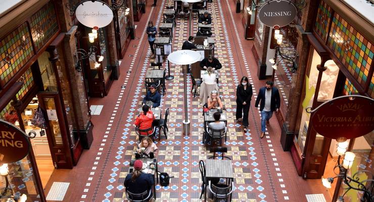
There’s been a mystery in the Australian economy. How the heck are we spending so much money in cafés when the cost of living is supposedly crushing us so badly? Café spending just keeps rising and rising, making a mockery of the idea of the oppressed Australian consumer.
Now the RBA has given us a big clue as to how it’s possible, with the following chart.
It shows an important difference. Wages per hour are rising less than inflation (left side). But actual income earned is rising more than inflation (right side).
People are doing more hours than before, getting more overtime, and pocketing bigger bonuses. That is adding up to more income, even though base wage per hour isn’t rising much.
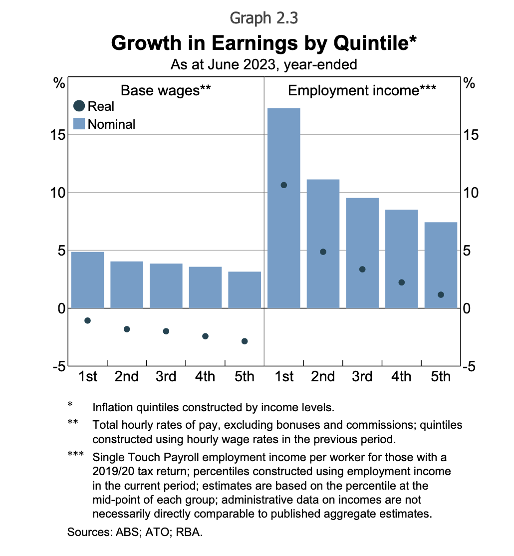
This graph has a lot going on. There are bars (not adjusted for inflation, aka “nominal”) and dots (adjusted for inflation, aka “real”). The group on the left shows hourly wages while the group on the right shows total employment income. The five bars are for the five income groups, from lowest (first quintile) to highest income (fifth quintile).
It shows that lowest income quintile has seen the biggest rise in wages and by far the biggest rise in income. The rise in wages is related to the minimum wage decision. The rise in income is related to the fall in underemployment. People who wanted more hours are getting them.
This also explains why mortgage repayments are going so strongly despite the rise in interest rates. There has been a rise in households in distress, but it’s certainly not a systemic threat to financial stability. And that’s because earners are making good money.
Feeling good about good news
What this shows is the power of low unemployment and a strong labour market. It is a huge buffer that means working families are coping well. Nobody’s losing their home. Most kids are going to get presents for Christmas.
But for balance and as a sop to the pessimists, there’s the following chart. It cuts things up differently. It looks at all families, not just those that have income from working. And it takes into account rising interest rates, not just rising prices. After you account for that (and even netting off higher interest received for people with cash) the average disposable income of Australians is down.
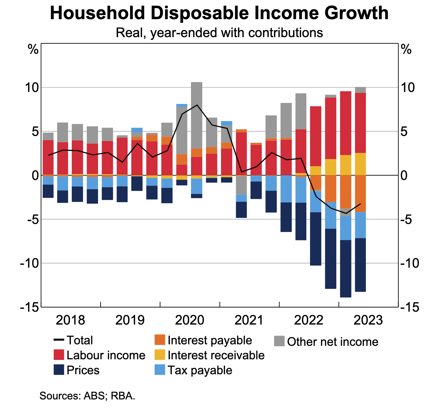
One notable thing about this graph is bracket creep. Higher tax payments have been a big drag on disposable income loss for a long time. That’s not a bad thing at the moment when we are trying to reduce spending in the economy to reduce inflation, but something to think about later.
Another interesting phenomenon is comparing people with cash and people with mortgages. This chart bundles them together to create a net negative. But the “average person” doesn’t exist. Instead, we have a big group suffering post-mortgage and a smaller group doing well.
The smaller group is receiving larger interest payments and the big group are making larger interest payments. Obviously, older richer people are in the small group, but so are some young people who have a big deposit saved up and have put off home ownership. A deposit of $100,000 is earning over $400 a month in interest if it is invested at 5%. That must help some prospective buyers be patient and stalk the housing market more slowly and deliberately than when deposits were earning no interest at all.
The key point to take away from this is that wages alone don’t tell the whole story of a tight labour market. Hours worked are really important to total income, and hours worked in this country are zooming upwards, creating more income than you’d think at first glance.
Have you been spending more or less money on meals out? Let us know your thoughts by writing to letters@crikey.com.au. Please include your full name to be considered for publication. We reserve the right to edit for length and clarity.




If we step outside quantitative economics for a moment, brunches, coffees etc are all done to maintain life-affirming social relationships, which become even more important when other parts of people’s lives are going badly. I suspect meeting friends and family over food and drink is one of the last discretionary spends to be sacrificed.
An article I can actually bear thinking about …
I”ve been amazed at this spending hanging on and that’s an explanation I had not thought of. I got rid of almost all that discretionary spending many months ago, due to mortgage, inflation, fixed full time job and static income. For friends and family, we gather at someones house. Fortunately the wine glut is keeping that cost fairly static!
I got a bit puzzled by the use of words such as “families” and “working families” and then “people” and “households”. Lots of people, and lots of households, are not families. Families are a distinct group, and using the word to refer to “everyone” just doesn’t work.
That’s all well and good for people in work where they get overtime and bonuses, those of us on the actual front end (I’m retail, the wife is call centre) are left behind
And with rent jumping 21% next month, and being too “rich” to get housing assistance/the NSW Govt only serving a few special people in shared equity, I’m out of things to cut after having one coffee at homemade buying the second, and switching to riding a bike to work to scrimp on petrol
So sure the RBA and “working families” see the “good” news, I’m the bad news wondering if I can get extra hours and only due a teensy 1% payrise this year (I hope)
The next step is move further out for “affordable” rent in a granny flat – the perks of a $100k household?
I despair of the current paradigm that we must maintain a minimum rate of unemployment for the good of the economy. Now we see that those who have a full time job are having to work longer hours to maintain their wages against inflation. What happened to the 70’s idea of the 35 hour week and the progress of our civilisation in this country?