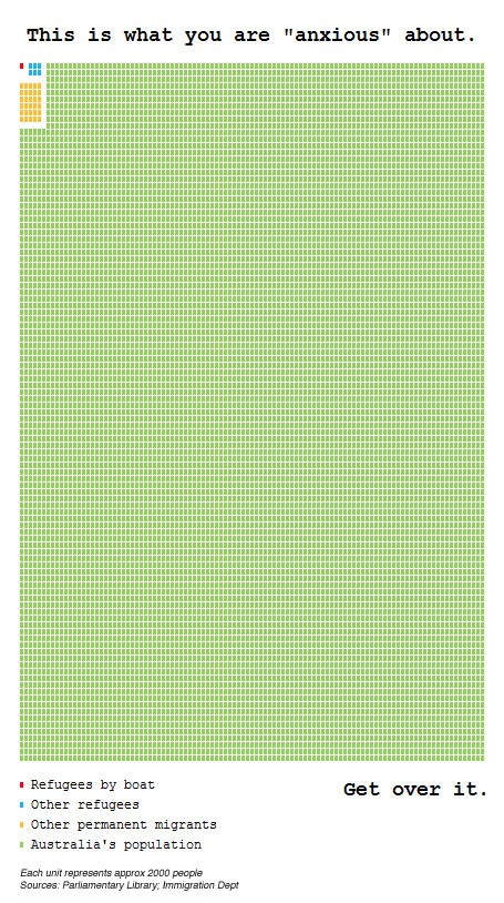
This week refugees, boat people and population growth have hit the headlines again. But what are the boat people statistics? See this fascinating infographic created by Robert Corr, with each unit representative of 2000 people.

This week refugees, boat people and population growth have hit the headlines again. But what are the boat people statistics compared to the rest of the Australian population?
article-article-bodyThis week refugees, boat people and population growth have hit the headlines again. But what are the boat people statistics? See this fascinating infographic created by Robert Corr, with each unit representative of 2000 people.

Ooh – Red Dots! Does this mean they’re communists as well as islamic fanatics?
Yeah but they double in population every year so by 2020 we’ll be drowning in them unless we drown them first VOTE 1 ANDREW BOLT
Great graphic – smart campaign. But it doesn’t compare apples with apples. If it was the green dots represented Australia’s natural birth rate, fair enough, but this represents an annual intake of refugees and migrants versus population. The tow are not the same measures.
Regardless of your view on this issue, we should be prepared to view the argument from relevant statistics, not manufactured ones.
Have a look at this graphic here. It shows it against the natural increase in the Australian population. Apples and apples.
Come in legally and i don’t have a problem, come here in a boat pretending to be a refugee, throw away your ID and who knows who you are? Go home!