There is a lot of talk about house prices in Australia. We hear much less about rental costs. Importantly for the inflation debate, house prices, which tell us the cost of buying an asset (namely a home), are not included in the ABS’s measures of inflation.
However, the cost of securing accommodation in this country — that is, rents — are naturally a key component of the inflation data. Indeed, rents alone make up 6.7% of the overall inflation index. (There are other housing-related costs in the inflation data, such as the cost of new dwellings excluding land, and the cost of making major improvements to homes.)
The cost of renting is relevant to owner-occupiers, investors and renters. When you buy a home, you save paying rent to another person. Alternatively, think about it this way: when you purchase a property and choose to live in it, you are foregoing the rental income you could earn if you rented it out. In the jargon, this is known as “imputed rents”.
For investors, rents are a critical share of their total income, or “total return”, which comprises capital gains (i.e. changes in the market value of the asset) and the income they get paid by the tenant.
Finally, for those who do not own the actual asset and decide to rent, changes in rents are important because they reflect changes in the cost of putting a roof over your head. Again, in the jargon, economists like to refer to this as the cost of “consuming housing services”.
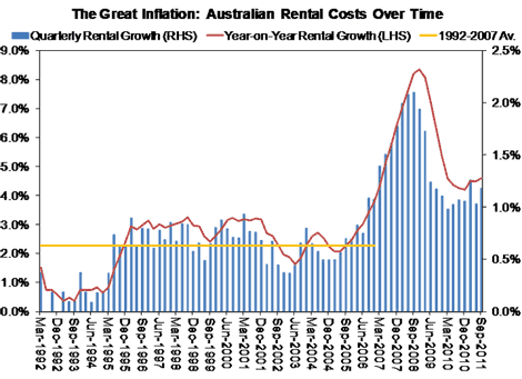
I have dived into the ABS’s inflation data to see what has been happening to rents over time. And, as the chart below shows, it is clear that there has been a structural increase in rents since the early 1990s …
Before about 2007, annual rental increases never exceeded 4% per annum. That changed in 2007 and peaked in December 2008 when rental costs rose to 8.4% per annum (refer to the red line in the chart above). While they pulled back over 2009 and 2010, rental costs have stabilised at a high 4% plus pace, which is well above the 2.3% per annum average rate between 1992 and 2007 (see the orange line).
More worryingly, since the end of last year, the cost of renting has started escalating again with the year-on-year growth rate hitting 4.6% per annum in the September quarter. The explanation for this structural change likely lies in an underinvestment in housing supply, which is something the RBA (more recently) and I (since 2003) have been banging the table about for a while.
*This article was first published at Property Observer

Gawd help me but that’s a bad graph.
What the hell is the right hand axis legend for, why is it’s scale so different to the laeft hand axis, what is it measuring?
I look forward to Adam Schwab’s response to this.
The history of analysis of real estate prices tells you to never believe any analysis that comes from anywhere within the industry.