Big news in Melbourne today: Mayor Robert Doyle has spent $240,000 on a new logo for the city.
This raises some pretty serious questions; namely: Melbourne had an old logo?
Apparently so, and it looked like this:
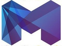
And here’s the new one:
It kind of looks like something from a cheap Cotton On shirt, but in terms of Melbourne PR wankery, it’s got nothing on those insipid ball-of-string ads. Speaking of which, here is the obligatory video clip they’ve made to spruik the new look:
Reactions have been mixed. Currently, 67% of Age readers and 80% of Hun readers have given it the thumbs down.
US design blog Brand New stumbled across the story and give their outsiders’ perspective:
There is something very appealing and avant garde about this logo and it walks a fine line between trendy-and-useless and progressive-and-defining, but I think it definitely swings to the latter … this identity has impact and adaptability beyond the logo and looks remarkably vibrant, dynamic and multi faceted, which is how I imagine the City of Melbourne to be.
Their commenters largely agree, though we did snigger at this scathing review:
It references the angles of a frankly embarrassing building near the central, 19th-century train station, an attempt to make a modern statement in a downtown which is characterized by a Gold Rush-era plethora of neoclassical buildings which are among the best of their kind in the world.
At Kodoz Design’s blog, Melbourne graphic designer Marc Katsambis says it’s growing on him:
At first glance, I was a little unsure if I liked it, as it does come across as ‘over-futurized’ and potentially, trying too hard to look like something from the year 3000. Not too mention the miniature rave dance party that’s going off in the top left corner.
However, after studying the logo for more than a nano second, I think the new logo has been well executed with a great style system/colour palette that would roll out nicely on Melbourne City’s streets.
And a terrible Google Translator version of this German design blog’s thoughts reveals this garbled European perspective:
A modern, contemporary logo that boldly and aggressively for a world metropolis, and really do not need to hide, what perhaps some cities have tried so far, has Melbourne with this new gig definitely done.
But just as a point of interest and comparison, here are how other cities in Australia have branded themselves:
Sydney. Hard to hate this, unless you’re one of those anti-Helvetica nuts — clean, modern and bonus points for not taking the easy option of a cheesy Opera-House-and-Harbour-Bridge motif.
Brisbane. Well, it’s very… Queensland. Kind of looks like those faux-vintage tshirts with things like “Jamaican me crazy” written on them, which were sort of hip until Roger David started selling them.
Adelaide. Wow, bland much? I’d insert the obligatory Adelaide-is-boring crack here, but actually, I really would have expected more from the home of the Adelaide Festival.
Perth. Really just the classic coat of arms here — not very cutting edge or much of a “logo” as such, but simple and classy.
Darwin. Quite nice, actually — you don’t really want anything too avant garde from Darwin, and the dragon fly is cute.
Hobart. A bit drab, but the subtle boat and water shape is a nice touch.
What do you think? A quarter of a million well spent or just pointless indulgence?



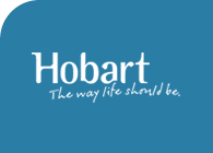

I’m pretty sure Hobart City Council’s logo is still this, not that you can tell by the tiny version hidden on their website. I think the one you linked is more like their odd wingy “that’s mel!bourne city” one.
I love this quote from the Age story:
Councillor Doyle listened to MC Hammer and Vanilla Ice?
You pay for designer goods and so you’ll pay for a designer logo. If you pay peanuts you’ll get monkeys. I wish people would stop applying 1980s prices to 2009 services. Personally I love the logo because it’s a great representation of all things Melbourne. Multifaceted and a jewel to those who grow to know and love the city. I also love it because it’s a courageous decision and it’s controversial. It makes people talk, it makes people think, unites and divides as art should and Melbourne is a work of art.
Raena is right.
This is the Council-the-organisation logo (the so-called corporate brand).
What you’ve listed is the Hobart-the-city logo (the so-called destination brand).
We also have a coat of arms if you’re into that.
Disclosure: HCC employee.
It’s a bit a ‘form and function’ thing with graphic design.
You can look at a logo in isolation and give a subjective opinion, but it’s how it works that is the test.
Assuming this is the main logo for the city it’ll have to work in all sort of places on all sorts of media — from street signs to a ‘favicon’ on a website. On that basis, the simpler the better because it will have the most flexibility. How will that logo look in a mono colour through a fax, for example?
On that basis too, you need to reconsider the Adelaide logo. It is simple, clean and versatile. I think the ‘M’ will date very quickly.
As for the money? You have big city pretensions, you pay big city prices. Come to Adelaide next time, the designers are just as good but they’re ‘big city’ up themselves.
i’m graphic design illiterate, so my reaction isn’t sophisticatd… “OH MY GOD! They’ve added colour to the yellow peril and made it their logo!”